The Art of Stephanie Paige

All art is but imitation of nature

Phoenix, Mixed media on panel 48" x 48"

This phrase, coined by ancient Roman philosopher Lucius Annaeus Seneca, perfectly describes the artistic approach of mixed-media painter Stephanie Paige. Her contemporary paintings are abstract landscapes pared down to simplistic compositions, which are anything but simple to construct. Large-scale panels balanced around stark horizon lines are created through a mixture of pigment and marble-dust plaster, a tricky medium that Paige discovered as a muralist painting frescos and Venetian plasters in southern California.

“It appeals to me because of how different it is,” explains Paige. “More than just the way it looks, I love the way it feels and what it can do.”

Hidden Sol 
Luna's Reflection 
Naranja Sol 

Paige began this abstract mixed-media style in 2008 after a search for peace
and balance in her life and a consequent discovery of Buddhism. This tranquility is reflected on her panels, with symmetry and balance playing a large role in the compositions. Nature is the inspiration and motivation for Paige’s art, and she creates each piece in honor of Mother Earth.

“In my work, I see rich textured soil, clear blue water, spacious open sky, or a soft breeze,” says Paige. “In my pieces, you can see the contemporary feel mixed with a rustic earthiness, two complete opposites that dance well together.”

Center of Love, mixed media on panel 64" x 80"

Not only does nature inspire Paige’s work, it also dictates the physical outcome of each piece. Plaster is sensitive to weather conditions and temperature, a quality that Paige sometimes takes advantage of to create texture. A piece with wet paint and plaster placed outside on a dry day opens up with cracks and peels, adding unique textural details to its surface.


Paige’s paintings will be introduced at Wilde Meyer Gallery at 4142 N. Marshall Way, Scottsdale The show title is Sophisticated Style Special Demonstrate ArtWalk, Thursday October 11th, 7:00 – 9:00 PM. Stephanie Paige will be demonstrating her painting skills with a pallet knife and marble plaster on wood panels.

What Catches Your Eye?

By Judy Feldman | www.wildemeyer.com

What makes you stop and look at a painting? Is it the subject, the colors, the textures? We are all drawn to art for different reasons, and often, it’s on a subconscious level. However, a skilled artist makes conscious decisions about how to attract a viewer’s attention. There are techniques such as composition, color manipulation, brushstrokes, and even canvas shapes that can influence our reaction to a particular work of art. Of course, the best paintings look effortless, but don’t be fooled!


Late for Supper, Peggy McGivern
16" x 20" mixed media on canvas

Peggy McGivern has an interesting way to begin a painting. She sketches with a blind contour line, which means she looks at her subject, not her sketchbook or canvas, and draws continuously without lifting her pencil. “With this technique, I can get interesting, exaggerated shapes from which to start my painting,” she said. “If I’m working plein air, I look at the scene, and what attracted me to it in the first place. I think that my viewers will respond to that initial impression.”
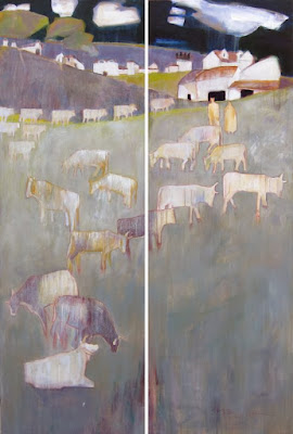
Come in Out of the Rain, Peggy McGivern
72" x 48" (diptych) oil on canvas

Peggy told me that when she’s considering a painting idea, she first looks at big shapes. In her painting entitled “Late for Supper,” about two-thirds of her canvas is the large area of land. The two figures’ vertical paths lead us up the painting towards the village, where she wants our eyes to rest. Peggy also said that she likes to avoid typical horizon lines. Here, the paths create bold geometric shapes that contrast with the distant buildings, and they give us the sense that the figures are quite far away from their homes, in a hurry to get there.

Color choices and brushstrokes convey the message in Peggy’s painting entitled “Come in Out of the Rain.” In this work, she wanted the viewer’s eye to go to where the rain is coming down on the cattle, so she chose beautiful iridescent paints and energetic brushstrokes to focus on that area of her work. The dark sky and purple hills in the background add weight to the scene, augmenting the feeling of an imminent downpour. Although it might look spontaneous, these decisions are thoughtful. “I’m always looking for weird, wonderful combinations for people to enjoy,” she said.

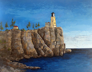
Split Rock, Melissa Johnson
48" x 60" Oil, Cold Wax, and Silver Leaf
Texture and paint application are other ways to call attention to a painting. Melissa Johnson mixes in cold wax to give her oil paints more body. Working with her palette knife, she can adjust the fluidity of the paint. She also uses the wax to adhere the different types of metal leaf she applies to parts of her canvas. Melissa doesn’t use a paint brush too often. “I use all sorts of tools to build up my layers: palette knives, credit cards (expired, I hope), dough scrapers, and any tools I might find at the local Dollar Store.”


Manville Road, Melissa Johnson
48" x 48" oil & cold wax metal leaf
Although Melissa’s paintings look three-dimensional, they don’t really have thick texture. It’s her skillful technique of applying multiple layers of wax-mixed paint that makes her images jump out, as you can see in her painting entitled “Split Rock.” The different tones and shapes of the cliff surface, along with the beautifully rendered crevices and light areas really pull the viewer into the painting and direct us to the lighthouse on the bluff.

Melissa explained that cold wax also speeds up drying time and adds transparency to the color. With this product, she can keep working on her painting by scraping off and applying more paint and wax until she is satisfied.


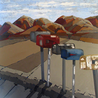
Mailboxes are the subject in her 48X48” painting entitled “Manville Road.” I really like this composition – even though the mountains in the background catch our eye with their gorgeous colors and 3-D presentation, the five mailboxes command our attention, as the applied metal leaf conveys strong reflected light.

Two Horned Cows, Joseph E. Young
36" x 24" acrylic on canvas
If you pass by one of Joseph Young’s paintings at Wilde Meyer, changes are, you’ll stop and look. Joseph is all about patterns, and there are so many! “I’ve always been a decorative painter,” he says Trained as an art historian, Joseph is influenced by many art movements, such as Art Nouveau, Arts and Crafts, and modernism. “Even abstract expressionists such as Jackson Pollack were decorative artists in their own way,” he commented.

Joseph likes to paint flat, and uses pattern to give the illusion of three dimensions. He juxtaposes colors that vibrate off each other. “If there’s no vibration, I add another contrasting color, until I get the desired effect. I want the colors to either work with or against each other to create excitement in the painting.”

Five Doves and Flowers, Joseph E. Young
36" x 36" acrylic on canvas
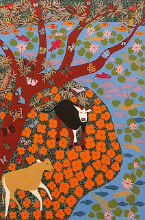
To achieve patterns such as these requires considerable patience. As you can see in his painting entitled “Two Horned Cows,” there are many different elements, and each has its own pattern. There are so many varieties of butterflies, flowers and fish; yet they are grouped in an organized, thoughtful way. You can tell that Joseph has a very strong sense of design (and an amazing ability to stay focused!).

“Five Doves and Flowers” is another example of this artist’s unique style. At first glance, we see the white doves, then the tulips, but on closer inspection, those small orange shapes are flowers and, wait, are those little eyes peeking out here and there among the flowers? Maybe they’re butterfly patterns, but they sure caught my attention!

So, the next time you’re drawn to a work of art, consider what made you stop and look. What emotions did it elicit? What do you admire about the artist’s style, and if it really excites you, consider adding it to your collection!

See more art by Peggy McGivern,  Melissa Johnson , and Joseph Young at Wilde Meyer Gallery.

Day of the Dead

By Laura Orozco Allen | www.wildemeyer.com

Celebrate with Us


Wilde Meyer Scottsdale galleries will have a Day of the Dead reception on 
Thursday, November 1st, 2018, 7:00 – 9:00 PM.

Tucson gallery will be on Friday, November 2nd, 2018, 5:00 – 7:00 PM.

So come celebrate with us! We will have an Altar and "Ofrendas" with treats for our dogs and cats, and Pan De Muertos and coffee for us humans. We welcome you to send copies of your favorite photos (non-returnable), to be displayed on our altars.


It is not a scary holiday. I can say it because I grew up celebrating it. Although I'm from the most northern part of Mexico, my hometown city's customs are a little Americanized and because of it, the typical Mexican traditions from Central and South Mexico are more diluted. But still, it was an important celebration.

As a child it meant my favorite time of the year was here! The air is (or was) full of the toasty smell of burning leaves. The air is cold and is windier there. The leaves walk with you as you go along with the wind... and we walked; my friend Norma and I walked everywhere.

The "Panaderias” (bakeries) would start selling the white sugar skulls, brightly decorated and with names on the forehead. It is fun to find yours and hopefully it is decorated in the colors you like.

Also “El Pan de Muerto” (Day of the Dead bread) would make their once a year appearance for a few weeks. The bread, sweet but a little bland, and is wonderful with a cup of hot chocolate or coffee. It is enjoyed in the evenings after a light supper.

Another sign that the "El Dia De Los Muertos" is near, is the flowers you'll see. "Mota De Obispo" is such a strange but beautiful flower. Deep red purple color and velvety to the touch. It looks like the ruffles and folds of a very elegant Spanish dancer dress.

The "Cempasuchitl" or Marigolds is another popular flower for this day. More than their bright orange color, what comes to my mind is their smell. They can fill the air with their aroma in churches and even the cemeteries. You can smell them from far away! In the spring I see them at the nurseries here, and to me, they will always be "Day of the Dead" flowers. Not a bad thing.

The cemeteries are full with visitors (live ones) the weekend before, the week of, and the weekend after. And it's really a celebration. People make it a point to come. Headstones get swept, polished, and even repainted. They are then decorated with flowers and veladoras (candles.) A mariachi band would play in the background or someone might bring a guitar and sing our gone relatives' favorite songs. Since it is an all day event people bring chairs, blankets, food, and drinks! Food vendors pass by saying "Elootess!" (corn on the cob) or it could be "Paleetass!” (ice pops) or something else. The rosary is read and yes, it can be a very sad day especially if it is a recent passing. But with the passing of the years it really becomes a day when you only think of the happy memories. The afternoon would be full of remember when’s…

In college, at La Univerisdad Autonoma De Cd. Juarez, we would have competitions of "Altares." Each group was assigned a different State to represent. This is really how I learned about some of the different traditions and customs each Mexican State has. One of my professors even had a real skull that she would bring for this special evening! While this was an academic assignment, it was a favorite, and looking back it gave me a deeper respect and admiration for this wonderful day!


Los esperamos! (or, we are looking forward!)

Self-Taught Narrative Painter

By Linda Carter Holman 

For whatever reason my expression of the world has generally been eclectic.


It must have something to do with my essence and the world born into…Oklahoma, South America, the Southwest, and California.

My father and his grandfather were both story tellers. Guess I inherited that gene. Being men, their stories seemed to be more about their adventures out in the world. My tales are based more on feelings… observed in simple everyday moments of life. 

Once upon a garden ...this story is based on events from my growing up to which I now have two large tortoises in the yard as living symbols.


“The creation of art
in all it’s diverse forms
allows each one of us
to sing the song anew.”

Along the way......
(the dark haired child...boy/girl)

The first part of my painting life, as I see it now was devoted to learning a language…technique, developing characters…mostly a woman’s perspective. I decided early on to use women and children as my story telling characters. One day I noticed that my men had a feminine/masculine look and the women masculine/feminine. So from then on woman became my symbol for both. Though I still picture the man child.


Creating a Personal Myth


Here on the Journey
(red Book, blue vase with fish
and Mount Fuji)


Myth is a feature of every culture.

I guess, Mythology has always been there in the background of my work.  Throughout time man has used symbols to give clues to what I refer to as “The Mystery of Life.” Over the years I have collected a variety of images that have developed special meanings  for me in my narratives…like the blue vase with goldfish that appear repeatedly in my stories.The red book has been there from the beginning. My stories on canvas were once more genre scenes.

In nature. Now they have become more personal and symbolic.


“Standing witness to the world that surrounds me…
Translating ideas, impressions and observations…
Getting to play all the parts in the story as it unfolds
With color, form and thought…
Each painting reflecting the world at particular moments in my life…
Accented with personal symbols
Collected over my 48 years of painting”


Crossing over
(fish, boat and swan plus my special character)

Pilgrimage to Mount Fuji ........(Mount Fuji a new symbol)

“the paintings are symbolic tales
Personal stories
Characters playing their parts
In witness to the all”


The Language of Color

By Judy Feldman | www.wildemeyer.com

This winter, I took a trip to San Miguel, Mexico. This colonial city bursts with color, and it’s not unusual to see homes painted in bright yellow, reds and greens, enhanced with beautiful foliage. The many shops display handcrafts that reflect Mexicans love of color.

The Colors of San Miguel
Judy Feldman
30" x 36", oil on canvas
When I returned here to the desert, I realized that our homes are painted to blend into the landscape, so color must occur inside.

That’s where art comes in. Many painters, especially those at Wilde Meyer, enjoy expressing themselves through the use of bright color. The gallery is known for its artists’ love of a strong palette, expressed in a variety of styles.
For Evermore
Cathy Carey
25" x 21", oil on canvas

Cathy Carey describes herself as a “contemporary expressive colorist,” and says that she strives to “use color to create emotional meaning and visual depth.” Although Cathy paints landscapes, she doesn’t use much local color. Instead, her goal is to communicate what the scene feels like to her, using strong hues. Cathy is very knowledgeable about color theory, and works with contrasts, such as warm against cool, light against darks, and brilliant hues adjacent to neutral tones. Her painting entitled “For Evermore” illustrates this technique. The purple mountains and vegetation pop against the bright yellow sky and paler yellow foreground. The tree trunk texture is created by warm hues against cool ones. Adding to the vitality of the painting are her beautiful brushstrokes, which remind me so much of Van Gogh. 

Sounds of Life
Cathy Carey
30" x 24", oil on canvas
Cathy told me that she is very influenced by the impressionist and post-impressionist masters. She said that Monet’s writings about color and composition are of particular importance to her. “I’ve learned to use diagonal shapes to guide the viewer’s eyes, and to circulate a color throughout the painting to create a unified look,” she said. You can see these ideas expressed in her painting entitled “Sounds of Life.” The diagonal movement of the painting images takes our eyes upward at first glance; then we can focus on the shapes, and see the animal curled up among the plants. Cathy uses her blues and greens in different areas, which unifies the painting, and the pop of red/orange against the greens enlivens it up. Her energetic brushstrokes, reminiscent of Van Gogh’s, really make the painting appealing to me.
Jack Roberts also strives to create a visual sensation through color. He, too, wants to stir the viewer’s emotions, and says that his abstract paintings are about pushing color and shape buttons. Jack works on a large canvas, on a flat surface. He says that he likes to paint wet-on-wet, so the paint is always moving. He uses many different implements, from plastic spatulas to push brooms and house paint brushes. A garden hose is used to remove paint in some areas, and reveal other dry paint underneath, to create the layers he wants.

Acoma
Jack Roberts
50" x 50", acrylic on canvas
I’m a person who thrives on color, so I’m very drawn to Jack’s paintings. As you can see in his painting entitled “Acoma,” his colors are very clear; he mixes beautiful opaques with jewel-toned transparent hues.

Pow Wow
Jack Roberts
50" x 60", acrylic on canvas
“Pow Wow” is another burst of color. Jack said that he was inspired by Native American dancers’ costumes. “What you see here are the garments, and a suggestion of figures moving,” he said. “But, I’m not interested in a linear interpretation. I like to work freely and go where the paint takes me. Although I want my work to look spontaneous, each painting requires considerable thought, to make sure that I achieve the proper composition and color relationships.”

 An interest in color also drives the work of Theresa Paden. Her paintings convey her love of animals, but they are not the usual wildlife art. They’re vivid and exciting because she employs energetic colors that aren’t traditional in any way. “When I’m painting, I enjoy experimenting with different color combinations,” Theresa said. “First, I do a drawing, based on a photo. Then, I do several small color studies to see which combinations depict the feelings I want to express.”

Bison on the Move
Theresa Paden
30" x 48", acrylic on canvas

Like all of us color-obsessed painters, Theresa says that she is inspired by the Fauves and Post-Impressionists. She adds that her color palette had been initially inspired by a trip to Santa Fe, when she was so enchanted by the light and the colors of the city, especially turquoise, red and coral. You can see this influence in her painting entitled “Bison on the Move.” The bright turquoise on the animal’s head and light yellow on its back tells us that it’s in sunlight. These colors, along with warm reds and browns enliven the painting and give it a contemporary look.


Meandering
Theresa Paden
20 X 20", acrylic
Theresa’s paintings are fresh and modern because she’s not trying to set her animals in a traditional wildlife environment. Instead, she creates abstract backgrounds with bold strokes of color. “Meandering” is a good example of this technique. “I’m trying to show dappled light coming through the trees on to the animal,” she said. “These backgrounds also set the animal apart and enable me to work in looser shapes and brushstrokes. I like to do something the camera can’t do.”

 Playing with color enables artists to explore creative possibilities and convey their emotions. Even though people say that “art imitates life,” I think that strong color can make art much more interesting than what we see!

You can see more work by Theresa Paden, Jack Roberts, and Cathy Carey at Wilde Meyer Gallery.