Seeing the world through rose-colored glasses: Three expressionist landscape painters

By Judy Feldman | www.wildemeyer.com


Lola's House, 40" x 40"
by Judy Feldman

Question: What kind of world is it when you don’t see black, grey and brown?

Answer: It’s the world of colorists and expressionist landscape painters.

You can certainly see my own love of color in a new painting entitled "Lola's House." I enjoy painting interiors and still lifes, where color is always welcome.

But, color isn't limited to interior settings. Landscapes, too, can push the boundaries of color, especially if artists express how they feel when they look at a scene, rather than try to reproduce it. These painters are happy! I also think that the southwestern landscape seems to encourage painters to see a bit out of the box.

Michelle Chrisman does the majority of her painting outdoors in New Mexico. "Part of the enjoyment for me is to be outside, to paint quickly and record my emotional response to what I'm seeing," she said. "I love to get in the zone, surrounded by nature, and paint alla prima, that is, wet on wet, finishing in one session." Her painting entitled "Luminous Light" is a good example of her fresh style. It's as if she took in her surroundings and expressed it in just a moment, to say how it affected her.


Luminous Light, 24" x 30"
by Michelle Chrisman

Michelle is a colorist who "hyper sees;" that is, she sees the hues that make up the local color others perceive. She's very interested in the effect of light and spectral color, which is defined by Wikipedia as a "color that is evoked by a single wavelength of light in the visible spectrum…" The spectrum often is divided up into named colors: red, orange, yellow, green, blue and violet.

"For me, paint is part of the experience," she said. "I want it to be luscious, to say "I'm paint, touch me!”


October in the Mountains, 50" x 60"
by Barbara Gurwitz

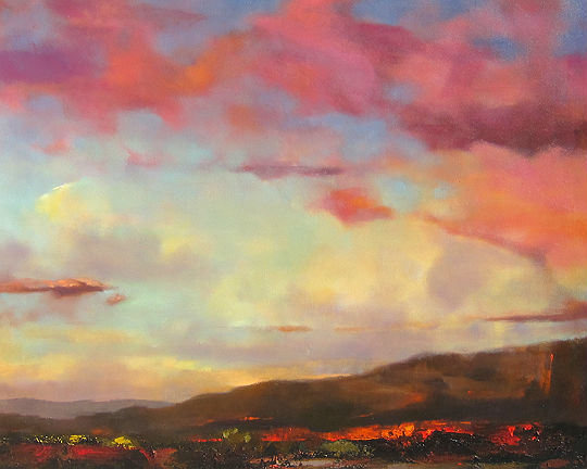
You can appreciate Michelle's technique and color vision in her painting entitled "Morning Light on Abiquiu Cliffs." I like the wonderful reds and yellows she uses to show warmth and light, contrasted with violet and greens to indicate the shadow side of the mountains. I think she wants us to focus on this area of the painting, as she uses much softer tones for the land and river in the foreground. So I’m guessing that it's the mountain that really grabbed her eyes. In addition to strong color, Michelle uses heavy texture with a palette knife to describe her landscape.

Barbara Gurwitz wants to create a sense of place in her landscape paintings. She takes photos and does sketches of the special places she wants to paint. But realism takes a back seat to the expression of how she felt at the time of her visit to the site. "I’m not interested in duplicating the colors of nature," she said. "I’ve always chosen colors that speak to the way I see the world, which are sometimes different from what you would expect."


View From the West, 24" x 30"
by Barbara Gurwitz

When looking at one of Barbara's paintings, "October in the Mountains," I know it's a scene of a southwestern village in the foothills of a mountain range. But her strong, primary colors give this landscape great energy and a charming, folk art quality.

Barbara also seems to see through rose-colored glasses, and that may be because she uses a red ground under her paintings. "It’s a wonderful neutral," she said. She leaves the red as negative space in some areas. This is evident in most of her paintings, such as "Santa Cruz Autumn" and "View from the West." The red under-painting makes everything glow!


Three in Ranchos, 32.5" x 38.5"
by Leigh Gusterson

Leigh Gusterson learned to paint in New Jersey and was trained in the Hudson River style of plein air painting. "It was grey and humid a lot of the time, and my paintings reflected that weather." But things changed when she relocated to Taos and experienced the effect of the light there. Now, Leigh loves to push color when she paints on location at her favorite sites.

"As artists, we train our eyes to see shapes, form and color more intensely," Leigh said. "I like to share what I see with viewers of my artwork. Sometimes, it's the awesome New Mexican landscape that displays these amazing colors!"

Leigh's loose, painterly style enables her to paint expressively. We can see her wonderful technique in "Three in Ranchos" and "Down in Pilar."

Like Barbara, Leigh enjoys painting scenes of villages nestled in the mountain foothills, with their farms, houses and church. She, too, chooses to wear rose-colored glasses, and infuses some of her work with a sense of whimsy, as in "These Sheep Need a Barn."

So, if you’re living in the Southwest, take a drive to a favorite spot and look again. You, too, may see some beautiful colors you’ve never seen before.

It Takes a Collector to Collage!

By Judy Feldman | www.wildemeyer.com

The other day, when I went into our guest bedroom, I noticed two of my mother's collage pieces on the wall. She was a painter, but she also loved collage. Aside from several works of art, she also left me bags of her raw materials: colorful papers, some ribbon, a piece of corrugated paper from the inside of a cookie box, a gold envelope, magazine images, and even a pair of old eyeglasses!

I googled the word "collage," and found some interesting information from Wikipedia. It said that collage is defined as an art form in which various materials such as photographs and pieces of paper or fabric are arranged and adhered to a backing. The word collage is from the French word "coller," which means "to glue." This term was coined by both Georges Braque and Pablo Picasso in the beginning of the 20th century when collage became a distinctive part of modern art.


Desert Cutlass, 24" x 48"
by Bill Colt

According to an essay from the Guggenheim Museum's online art glossary, the glued-on patches that Braque and Picasso added to their canvases offered a new perspective on painting when the patches "collided with the surface plane of the painting." From this perspective, collage examined the relationship between painting and sculpture, and these new works "gave each medium some of the characteristics of the other." The Guggenheim essay also noted that the use of bits of newspaper was a reference to current events, and to popular culture. This juxtaposition of signifiers, "at once serious and tongue-in-cheek," was fundamental to the inspiration behind collage.

There are several artists at Wilde Meyer who use collage in their artwork. I spoke with three of them.


Woody, 12" x 12"
by Bill Colt

Bill Colt is following the tradition of Braque and Picasso, using pages from old magazines he finds in antique stores to inspire him. "I call it 'retro collage,'" he says. Bill collects old magazines dating back as far as 1947 (Colliers); Life magazines from 1952,as well as old copies of Good Housekeeping, Family circle and Look Magazine. He’s really interested in the old ads. His painting, entitled "Desert Cutlass" has some of those 1952 clippings which he paired with his image of the old Cutlass. Underneath the paint surface of the colorful "Woody," painting, Bill has collaged old cartoon clippings, including one at the bottom of the page with a boy and his dog that you may recognize.


In Country, 24" x 48"
by Bill Colt

Bill is a corporate pilot, and his airplane paintings include pieces of aviation maps, old Pan Am ads and aviation engineering manuals. "In Country" depicts F4 fighter planes from the Vietnam War, and if you look closely at the upper right corner, you’ll see a 1960's image of Jim Morrison.

Bill's collage technique is pretty methodical at first. To start, he creates texture on his canvas with joint compound and bits of things like cheesecloth. Then, he collages pieces of his printed materials on the canvas with gel medium. As the creative process takes over, he draws his image in charcoal, and then paints with acrylics, covering some of the collage work. To finish, Bill glazes his painting with a product that deepens and enriches his colors.


Backroad Boys, 36" x 36"
by Charles Davison

Charles Davison considers himself a multi-media artist. He takes the collage concept even further, using beads, buttons and other items, in addition to paper and fabric, to create his artwork. Charles has been in Arizona since 1978, but even when he lived in New York, he said he was interested in southwestern themes. He said that his work has evolved from a non-representational style with neutral tones, to his current focus on horses and Native Americans, all painted in bright colors and enhanced with his collage work. For example, in "Back Road Boys," he uses fabric to create the cowboys' scarves, two of the shirts, and the brown pants. Actual buttons are glued on to the shirts, and the buckles are made of buttons and other materials.


Dawn Council, 28" x 38"
by Charles Davison

The Native Americans depicted in "Dawn Council" are wearing actual beaded necklaces, and their clothes are painted, then covered with strips of fabrics.

I think Charles' talent lies in the way he seamlessly combines his painted images with collage. Even though he uses many different materials, his paintings still have a unified look.

Like all multi-media and collage artists, Charles is a collector. He gets his materials from the desert, antique stores and thrift shops. His large, colorful fabric collection inspires him, as do his other found objects. They all enable him to work in multiple layers, adding materials as his paintings evolve.

Kristin Knight creates interesting mixed media paintings. They have a sense of history, since their first layer is a collage of antique images and pages from old books as well as music paper from player pianos. "I use three to five layers of papers – sometimes I also incorporate pieces of old watercolor paintings I've done," she said. "The shapes and textures of these collaged papers create an abstract under-painting. It's pretty labor intensive."

She then paints equines, buffaloes or Native American images in rich sepia colors. Finally, the paintings are covered with resin varnish.


Amazing Grace, 28" x 38"
by Kristin Knight

Kristin has been an equine massage therapist, so she has an intimate knowledge of horses' muscle and bone structure. You can see her understanding of these elegant animals in her paintings entitled "Amazing Grace" and "My Prairie." In the latter, she has allowed the print from book pages to show through parts of the painting.

"My paintings merge the history of the layers with the glossiness of the surface so that the images float in a sleek liquid space," she said.

By adding a third dimension to what is normally a two-dimensional art form, multi-media paintings with collage have a tactile, textural quality that is very appealing. I think we react with surprise and wonder when we examine these paintings and see the bits and pieces of things that have been incorporated by the artist.

These three artists, as well as several others are currently displaying their mixed media work in a month-long show at Wilde Meyer's Marshall Way gallery.

Here, Kitty, Kitty . . .

Everyone knows Wilde Meyer loves animals. Many of the artists here paint creatures, from birds, to dogs and cats and even chimpanzees (for example, see my blog on Jeff Cochran). But a few weeks ago, the gallery on Marshall Way was actually “home” to a litter of kittens and their mom, in a very strange way.


Laura heard some footstep sounds from above the ceiling, and thought it was bugs or rodents. But when Jonathan opened one of the ceiling panels, he discovered five kittens! Apparently, they fell through a vent pipe on the roof.


It took five days to rescue them – one actually fell down from the ceiling through the wall, which had to be cut open. The day of the rescue, Lisa Gordon, a gallery artist, was visiting and offered to take the kittens with her to Santa Fe. She’s found homes for all of the kittens.


Laura and the staff have been feeding the mother, who, apparently, has also been fed by the Stephen Paul Hair Salon staff next door. Laura took her to her vet and had her spayed, then brought her back to the gallery to recuperate. She kept her enclosed in the back room during the weekend, but when Laura returned on Monday, she heard sounds coming from the gallery. Somehow, the cat had escaped and decided to look at the art!


Since she’s a feral cat, everyone decided to let her back out again, but still leave food for her to eat. So, if you happen to visit Wilde Meyer, keep your eye out for our adventurous kitty.

Good deeds get rewarded. Since her offer to take the kittens, Wilde Meyer has sold four of Lisa’s sculptures!
Hula Hoop 3.5" x 4" x 2.5"
by Lisa Gordon
You can see more art by Lisa Gordon at Wilde Meyer Gallery.

Art and Spirituality

By Judy Feldman | www.wildemeyer.com

Is there a special relationship between art and spirituality? There are many reasons to think so. Art and traditional religions have always been linked – some of the greatest paintings and sculptures have had religious themes.

I think artists have always striven to express something that’s beyond the material. The “language” of art can be an emotional reaction to a beautiful landscape, a completely conceptual piece that conveys a personal message, or an image that tells a story of importance to the artist. Often, there’s a spiritual component.
Ghost Shirt series #4  61"x61"
by Jim Nelson
  There are two artists at Wilde Meyer who express spirituality in very different ways. Jim Nelson is a painter and storyteller of legends of the Lakota tribe of South Dakota. Although he is not of native heritage, Jim grew up near the Pine Ridge reservation and was friends with Lakota children. Their culture became part of him, and he has always painted their stories. Everything in Jim’s work has a meaning, expressed through vibrant colors and symbolism. He says, “I don’t just paint a person or an animal. I paint the spirit of that person or animal, and hope that the viewer will gain an understanding of this people and their culture.”

According to Jim, four primary colors represent the four sacred beings of the Lakota. Red is the highest spiritual color; blue represents the wisdom of the Sky Father; green is the Earth Mother; and yellow is the color of rocks in high places that overpower anything that stands next to them. When you look at Jim’s work, almost all paintings include these strong colors.

Paint Their Face Red 30.5"x30.5"
by Jim Nelson
For example, in the painting entitled “When Ravens Call to Her,” red is the dominant color, indicating the high spiritual nature of the woman, who has the souls and spirits of soldiers killed in battle, brought to her by the ravens who are pictured flying across her body. Jim says that these spirits are then given to the Grandfather of the North Wind (indicated by the deep blue), who puts them in the northern lights in what is called a “shadow dance.” If the eyes of this woman seem very compelling, it’s probably because Jim begins every painting with the eyes of his subject and, he says, they pull him in and dictate the course of the imagery. All of his faces are deep in thought because they are telling an important story.

When Ravens Call to Her 48"x48"
by Jim Nelson
 There are many other symbols in “Bird Woman,” which depicts a healer of battle wounds. Her striped face means that she’s been touched by a grizzly bear and has his protection. The butterfly symbolizes a messenger from the Earth Mother who teaches the healer her ways. The circles on the left side of the painting represent the lodges where the tribe once lived, and the deep blue background again connotes the wisdom of the Sky Father.

Bird Woman 36"x36"
by Jim Nelson
See the Medicine Hat 31.5"x26.5"
by Jim Nelson
I asked Jim about the image of the American flag, which appears in the painting entitled “Blackbird's Day.” He said it refers to the encroachment of the white man on the Native Americans’ lands. This painting, too, has a very strong message, which is seen in the eyes of the subject; the use of the important four colors – especially red – and the symbols. The latter appeal to us because of their decorative design, but they mean so much more, once Jim explains their significance. You can certainly appreciate his work on a purely artistic level, but when you probe and learn the spirituality beyond it, these paintings become so fascinating!

Blackbird's Day 30.5" x 30.5"
by Jim Nelson
Albert Scharf takes spirituality in another direction. His series of new paintings are inspired by the Kabbalah, the study of Jewish spirituality and mysticism. Albert says about these paintings: “I think of these pieces as meditation plaques. The Hebrew letters are like antennas to me; they make me think about things that I don’t normally contemplate. The letters also have a sound that can be chanted as a meditation.”

Left: Ayen Shin Lamed mixed media on canvas 20"x16"
Right: Mum Lamed Hey oil and sea shell mixed media on canvas 16"x20"
by Albert Scharf
As I said before, spirituality and art are connected. Albert’s Kabbalah-inspired paintings, such as “Ayen Shin Lamed” and “Mum Lamed Hey” are pleasing to look at, but they invite us to go deeper and pursue their meaning.

Landscapes #704 and #705 diptych
24"x24" total
by Albert Scharf
So, to learn a little about Kabbalah, I went to the website “Judaism 101.” Here is part of the explanation on the site: “According to Kabbalah, the true essence of G-d is so transcendent that it cannot be described, except with reference to what it is not. This true essence of G-d is known as Ein Sof, which literally means "without end," which encompasses the idea of His lack of boundaries in both time and space.

I still didn’t understand the definition, so I went to www.kabbalah.info.com. Here, it was stated: “In simpler words, there is an upper, all-inclusive force, or “the Creator,” controlling everything in reality. Some of these forces are familiar to us, such as gravity or electricity, while there are forces of a higher order that act while remaining hidden to us. Kabbalah holds the map or the knowledge of how these hidden forces are structured, and the laws by which they influence us.”

Albert also expresses his spirituality in his cloud paintings series. He says that he sees clouds as the transition state from land to the sky. “Spiritual energies are transmitted to us through the clouds. Their light affects our moods.”
Landscape #715 50"x60"
by Albert Scharf
 As you can see in “Landscape 715” (yes, he numbers his paintings and has done nearly 800), the clouds pull us into the painting and encourage us to go to a meditative place. “Landscape 682” also conveys the importance of color to Albert. He does not use local color, but prefers to select saturated hues that he says are the emotional content of his art. “If I can get people to experience an emotion, they can raise their consciousness to a higher level.”

Landscape #703 48"x36"
by Albert Scharf
You can see more art by Jim Nelson and Albert Scharf at Wilde Meyer Gallery.

Meditation and Mystery

Jeff Cochran explores the natural world of landscapes and primates.

By Judy Feldman | www.wildemeyer.com

Transformation 48"x34" oil on canvas
by Jeff Cochran
Many painters like to switch back and forth with their favorite subjects. I find that I tend to go from interior settings with many details to still lifes, which are much more relaxing. 

Jeff Cochran focuses on two very different subjects: landscapes and chimpanzees. You might wonder if there is any connection between the two. I certainly did, so I gave him a call.

Obviously, interest in the natural world is a link. But, mystery is also the common thread. Jeff says that chimps have a certain mystery – they are human-like and can connect with the viewer, who wonders what they are thinking. His landscapes have a sense of mystery, too, painted in a dreamy idealized style.
When I looked at some of Jeff’s paintings, I was reminded of the Hudson River School, a mid-19th century American art movement of landscape painters whose vision was influenced by romanticism. He agreed that he, too, liked to portray pastoral settings. “My paintings look like a place where you could go and sit and think,” he said. Instead of New York’s Hudson River Valley, the land around his home in Taos, New Mexico is Jeff’s inspiration.

Late Summer Irrigation, oil on canvas 54" x 68"
by Jeff Cochran
“I like to do plein air studies in the alfalfa fields that are in this area,” he said. “The rolling mountains and irrigation washes also become subjects for my paintings. There’s a certain atmosphere around here that gives a soft glow to the surroundings.” You can see examples of these places in his paintings entitled “Irrigation at Patrick’s Place” and “Late Summer Irrigation.” These works are larger paintings, taken from his studies and done in his studio.

Irrigation at Patrick's Place oil on canvas 32" x 33"
by Jeff Cochran
Although Jeff paints from nature, he is not interested in being a purely representational artist. His paint palette does not always reflect local color; rather, he prefers to use muted hues that convey his romantic view of the scene. “A Soft Summer Afternoon” and “Pasture in Talpa New Mexico” both have that dreamy quality that draws people to Jeff’s work.

A Soft Summer Afternoon, oil on canvas 46" x 56"
by Jeff Cochran
Pasture in Talpa New Mexico, oil on canvas 40" x 48"
by Jeff Cochran
So, then, you might wonder why he likes to paint chimps. According to Jeff, about 20 years ago, he visited the San Diego Zoo, and was impressed by their amazing chimpanzees. “I started painting them, and people responded very well,” he said. The eyes of these creatures and their soft, fuzzy fur are very appealing. Since he seems to know them so well, he has humanized them in portrait form. “Transformation”(shown at the top of this post) and “Psychedelic Chimp #9 are good examples of Jeff’s skill in getting up close and personal with these creatures, and adding some humor as well.

Psychedlic Chimp #9 oil on canvas 50" x 46"
by Jeff Cochran
His fascination with chimps and their portraits led to his acquaintance with the renowned primatologist, Jane Goodall. Jeff’s relationship with Jane Goodall came about when he found out about her Institute’s annual fund raiser. Uninvited, he sent them a four-foot chimp painting. Jane Goodall loved the painting and didn't want to auction it so she could hang it in her office. “I sent a second painting to donate to the auction, and later on, I attended her 70th birthday party.”

Jeff has a third area of interest. He’s also an organic farmer, selling vegetables at farmer’s markets, as well as opening his farm to young people interested in gardening and farming. Cochran thinks of his farming as art, and that what he is really doing is creating a giant land sculpture. Maybe we can look forward to seeing some romanticized vegetable gardens!


You can view more of Jeff Cochran's art at Wilde Meyer Gallery.

Zooming In

By Judy Feldman | www.wildemeyer.com

There are many different ways of catching the viewer’s eye. In painting, obviously, subject matter, color choices and brushstroke all work to render a work more or less interesting. But composition is just as, or even more important to a painting’s success.

Watching Over You 19" x 30" watercolor on paper
by Patricia Hunter
Some artists use a close-up technique in their compositions. Instead of trying to get a lot of information in their painting, they zoom in to an area of interest. You can appreciate this technique in Patricia Hunter’s work, especially her images of exotic animals. When she started painting these animals a while ago, she decided that she didn’t want to do typical animal portraits; she wanted to show something real in an abstract way.

“By painting close-ups of the animals, I can achieve a different kind of composition, and focus on design and texture,” she said. “This technique also enables me to include considerable details in the work, such as the animals’ hair and whiskers.” By the way, Patricia is a watercolor painter, which makes her technique even more amazing to me!


Family Gathering 22" x 30", watercolor on paper
by Patricia Hunter


Walk With Me 8.25" x 10.25"
watercolor on paper
by Patricia Hunter
Although we can discern the two zebras in “Watching Over You,” this painting has a definite abstract quality, and the patterns and shapes of the zebras’ stripes could easily be a textile design. “Family Gathering” has the same compositional style: we know there are several giraffes portrayed, yet the main interest is in the patterns of their interesting hides.


Downtime 18.5" x 24" watercolor on paper
by Patricia Hunter

Lately, Patricia has been focusing more on domestic animals. Her dog, Sunny, appears in “Downtime” and “Walk with Me.” Although they are realistic impressions of the subject, you can see Patricia’s interest in pattern by the way she paints the details of her dog’s coat.


Moo Bull 5" x 5" oil on canvas
by Sheridan Brown
Sheridan Brown likes to zoom in on her subjects’ eyes. “They have an expressive quality that I want to convey in the painting,” she said. Like many Wilde Meyer artists, Sheridan’s subjects frequently have fur and four legs. Often, they’ve met at the local dog park! Sheridan likes to combine an abstract background with her close-ups. Many of her paintings are small sizes and have a loose, painterly style.


Bright Eyes 6" x 6" oil on canvas
by Sheridan Brown

In “Moo Bull” the background and the subject are equally arresting, but the way she pulls the colors together make this 5”X5” painting work.


Anticipation 24" x 24" oil on canvas
by Sheridan Brown

“Bright Eyes” is another example of how Sheridan unites an interesting abstract background with the focal point – the cat’s face and eyes. In “Anticipation,” the colors of the dog’s ear and mouth reflect the floral pattern in the rug.
Background design is not of great interest to Stephano Sutherlin, except to offset his subject. His dog portraits speak to the viewer – literally. They have catchy titles, like “Do I Amuse You?” and “Can I Go, Can I?”. He zooms in on their faces - which take up most of the square canvas - and somehow gets an expression that has a human quality. His bold use of color makes the paintings pop – we really can’t ignore them!

Do I Amuse You? 24" x 24"
by Stephano
acrylic on canvas


Can I Go, Can I? 24" x 24" acrylic on canvas
by Stephano

I Dare You To Lift Your Leg 40" x 16"
acrylic on canvas
by Stephano


Stephano generally favors a square format, but his choice of a narrow 40”X16” canvas for his painting “I Dare You to Lift Your Leg” pushes the cat and the fire hydrant into a tight frame. Are they actually having a conversation? It kind of looks that way!


Bedroom Eyes 9.5" x 9.5" oil on canvas
by Sarah Webber
Sarah Webber also likes a close-up perspective. She says she has an “intense” personality, so zooming in to a subject appeals to her. By getting “in the face” of the animals she paints, she can give them a personality of their own, and often with humor.

For example, the owl she portrays in “Bedroom Eyes” has a “come hither” look! The rest of his face and chest are painted in a loose colorful way, so the eyes are all the more riveting.

A Room with a View 21.5" x 21.5" oil on canvas
by Sarah Webber
Pig in the Straw 19" x 22.5"
 oil on canvas
by Sarah Webber
In “A Room with a View,” we see the humor in the donkey peering out from his stall. By painting the cropped image of his head and the stall opening, Sarah conveys the situation this fellow finds himself in. “Pig in the Straw” attracts my attention because the pig’s head and upper body are portrayed in such a painterly way, with a beautiful shadow cast on the straw. I don’t think any of these paintings would be nearly as interesting if they were ordinary views of the animals.

I guess you could say that close-up views are the painter’s way of making the ordinary into art!

You can see more by Sarah Webber, Stephano, Sheridan Brown and Patricia Hunter at www.wildemeyer.com.

A Fresh Outlook

By Judy Feldman | www.wildemeyer.com

In French, there’s a saying, “changer les idées,” which could be translated literally to mean changing ideas, but what it really means is doing something different – leaving your usual environment – to get a fresh outlook on things.

House in Vinales by Judy Feldman
House in Vinales 24" x 36"
by Judy Feldman
Just recently, I was able to “changer les idées” by taking an eight-day trip to Cuba. It’s a place I’ve always wanted to visit, since I lived in South Florida, where so much of the Miami culture is Cuban. Also, I was intrigued that a country so close to us could be so different and somewhat forbidden. I went with a group that had a “people to people” permit and an interest in nature. We traveled over about two thirds of the country, and often, I felt that I was in a different time – namely the 50s. (The cars are amazing!)


Playa Largo beach house
Leaving one’s usual environment is good for an artist. We get to see new things and think about how they can translate to our art. I was so impressed with the lush beauty of Cuba, its simple, even retro lodgings.


the colorful, small houses:
Vinales house
 and amazing people who enjoy their music and art so much:


I’ve finished one painting inspired by my trip, "House in Vinales," shown at the top of this post. Working on it brought back memories of these travels and the visual sensory feast I enjoyed.

Bill Colt, another Wilde Meyer artist, also has been inspired by Cuba. Bill’s passion is cars, and I think he also found his visual feast there. I’ll quote him: “It's all about the cars. They say the best auto mechanics in the world are in Cuba because they have to keep 50 year old cars running with virtually no parts.”

The Island City by Bill Colt
The Island City 24" x 36"
by Bill Colt
See more art by Judy Feldman and Bill Colt at Wilde Meyer Gallery.