Art treasures for the holidays

By Judy Feldman | www.wildemeyer.com

With the holiday season comes the quest for gifts for friends and family. For many people, it’s an overwhelming task, since stores are filled with merchandise, and finding the right present can be difficult. So, how about a gift of art? A hand-crafted glass or ceramic piece, a small painting or sculpture would be a unique way of showing your holiday wishes, and the recipient will enjoy it for a long time.

At this time of year, Wilde Meyer Gallery asks its artists to produce small works that would be appropriate for gifts. It’s a great way to give (or acquire for yourself!) a piece from a favorite artist that you may not have been able to afford in a larger size. It also gives you a chance to get to know most of the artists there, since many small pieces are be displayed at once. This year, the show is called “Treasures,” and it will run in Scottsdale until Christmas, then will open at the Tucson location.

Holiday Nap 12" x 12"
Judy Feldman
Bruno Waiting 14" x 11"
Judy Feldman
I find it fun to do small paintings, since I can work fairly quickly. The two here, “Bruno Waiting” and “Holiday Nap” have an intimate quality that I like. Even though I love details, I tried to keep the images fairly simple.

Sounds Reasonable 10" x 10"
Linda Carter Holman
Crazy Eyes 14" x 11"
Connie Townsend
When I went to the gallery yesterday to look at the wall of small paintings, a few caught my eye. Connie Townsend has a portrait of one of her chickens in her distinctive style called “Crazy Eyes.” Linda Carter Holman has included some of her favorite things in her painting entitled “Sounds Reasonable,” such as the Calla lilies, the goldfish, fruit bowl and a dog with an expression that reminds me of one of her gracious ladies in larger paintings.

Let's Go 12" x 12"
Timothy Chapman

Timothy Capman’s “Let’s Go” painting reflects his whimsical ideas; this time, a blue bird with a saddle is taking flight off a plateau. Great idea for a traveler friend! Trevor Mikula has painted one of his distinctive dogs with a touch of humor, entitled “She’s a Lady.” And, if you like Bill Colt’s cows, you’ll see a few on the wall.

She's a Lady  12" x 12"
Trevor Mikula
So stop by and see the amazing wall of Treasures. There’s really something for everyone’s tastes. The gift of art is a unique and memorable one!

Treasures is on view until January 2, 2016. You can see more work by Judy Feldman, Connie Townsend, Linda Carter Holman, and Trevor Mikula at Wilde Meyer Gallery. 

Artists Make their Mark

By Judy Feldman | www.wildemeyer.com

Close Red and Yellow Bands 72" x 48"
Ron Russon 
When we look at two-dimensional art, the overall image strikes us first. But then, our eye is usually drawn to the distinctive marks that define an artist’s work. By marks, I mean the brushstrokes, the textures and whether the image is done in a loose, gestural style, or a more controlled, structured way (see my last blogs about the latter).

Artists’ mark making is so personal; it may be deliberately planned at first, but then it becomes part of the flow of creating, an intimate part of their artistic process.

When I interviewed some Wilde Meyer artists about the way they work, quite a few told me that they like to use many layers when they’re painting. Melissa Johnson said that the process of layering “shows the history of the painting.” Melissa’s unique marks are related to the variety of tools she employs – never a paintbrush because she hates cleaning them! Instead, she uses old plastic gift cards; her husband’s old driver’s license, chopsticks and crushed paper, to name a few. “Each tool has a different flexibility, which gives different textures,” she said. If Melissa wants to pull paint away from the canvas, she uses tin foil, waxed paper or tissue paper to achieve different results.

Structure
20 " x 20" oil, cold wax & metal leaf
Melissa Johnson 
“It’s not a predictable method, but I’ve learned over time the steps I need to take,” Melissa said. She noted that she begins with a realistic image, and as she builds up layers or takes away paint, the painting gets more abstract. Melissa’s marks are also a product of a medium she uses: cold wax. “By mixing in the wax with my paint, I get a beautiful translucency, even with opaque colors. Plus, I can also carve marks into it, using ceramic and sculptural techniques. When I’m finished, I give the painting a light coat of the wax, polished with a soft cloth.”

You can see an example of Melissa’s strongly textured painting in her work entitled “Structure.” Here, her abstract shapes take the form of a house, and you can decide if she began with a more detailed house, or if that image evolved along with the other geometric shapes.

Ancestral
20" x 40" oil, cold wax & metal leaf
Melissa Johnson 

Digs
8" x 10"
oil, cold wax & metal leaf
Melissa Johnson
Village
8" x 8"
oil, cold wax & metal leaf
Melissa Johnson
Melissa said that her art often has a Native American influence. Her painting entitled “Ancestral” is part of a series that reference reservation life. The texture in this painting and many others is also enhanced by the addition of metal leaf. The black and white checks are a recurring element in this series, which includes “Digs” and “Village.”


Brenda Brevik describes her work as “representational, but not highly rendered.” There is definitely recognizable imagery in her paintings, but she is more interested in the physicality of the painting process. “I want to show evidence of the trip,” she said. “I use layering to add depth, and give the viewer some eye candy to explore the painting.”

2 Nudes 
60" x 48"
Brenda Bredvik
Brenda has an array of mark making techniques. In her painting entitled “2 Nudes,” she purposely includes evidence of her line drawing of the two figures, especially the one on the right. For the background, she uses another mark – rough brushwork layered over what appears to be horizontal lines. To me, the figures are very appealing, but it’s the different marks Brenda makes that are so interesting.
Breaking Free
65" x 57"
Brenda Bredvik

Brenda’s layering often takes her painting from one subject to another. She said that “Breaking Free” started out as a painting of Mt. Whitney, then became an abstract, and then she added the horse. Her brushstrokes give the painting great energy, especially the flying mane, and the pop of orange squiggles on either side of the horse and the fuchsia one under its foot. This painting also shows another of Brenda’s marks: areas of dripped paint. “I like the pattern that’s created when I let paint with medium drip from the brush,” she said.

Poetry
50" x 40"
Brenda Bredvik
“Poetry” also began as an abstract. To add interest and contrast, she painted the vase of flowers in a more realistic, elegant style, using much smaller brushes, and a palette knife, to make the flowers look “yummy.” The paint drips under the slash of white and the dark shadow conform to her mark-making style.


Green Left Foot  
16" x 20"
Ron Russon

Ron Russon has a degree in illustrative design, which is reflected in his stylized depiction of animals. “I used to paint traditionally, but I got bored,” he said. “So, I started to use non-traditional colors. That opened up a whole new world, in which I could make my own rules.”

In addition to his color choices, Ron’s marks also include thinned paint dripping, along with a mix of flat and three-dimensional rendering, all in the same artwork. You can see this technique in his painting entitled “Green Left Foot.” Ron said that he likes playing with planes, crossing back and forth between realism and his imagination.

Like the other artists mentioned above, Ron doesn’t use a paintbrush very much. He’ll use one to draw in the shapes, but then takes up his palette knife to add blocks of color, scrape away areas, and create textures. “Charolais Bull” is a good example of his mark-making process: the horizontal lines are both applied paint, and paint scraped away. Ron explained, “I started with drips of oil paint and turpentine, then I drew in the bull vaguely, then I moved back and forth, like a dance, between realism and abstraction. It’s like a dance: I lead and the painting follows!”

Charolais Bull
48" x 48"
 Ron Russon 

Most of all, Ron said that his style is always evolving, and that he strives to provide his viewers with something interesting to look at and reflect on. I think that his marks, and those of Brenda and Melissa, are successful in doing just that.

See more work by Melissa JohnsonBrenda Bredvik, and Ron Russon at Wilde Meyer Gallery.


Divine Bovines are Udderly Wonderful at Wilde Meyer!

By Judy Feldman | www.wildemeyer.com

Growing Pains  24″ x 48″
Sarah Webber
Wilde Meyer artists tend to like animals. It’s not at all unusual to see images of dogs, horses and even chimpanzees when you walk into any of their galleries. But, this month, some other animals will be prominently displayed in Scottsdale at the first “Divine Bovine” show.

Here, you’ll see all sorts of bovine art: cows, buffalo, bison and yaks. At least 25 artists are participating in this themed show. Some of the artists, like Bill Colt and Sarah Webber, have favored painting bovines for quite a while.

Onlookers  18″ x 24″
Bill Colt
Lily Fair  24″ x 20″
Bill Colt

How Now Brown Cow  30″ x 30″
Judy Feldman
For some, like me, it’s a first time we’ve painted a bovine. I don’t know why I never thought of it before, because I do think cows are beautiful, especially their expressive, heavily lashed eyes. I thoroughly enjoyed painting “How Now Brown Cow,” and I really did feel a bond with this lovely creature!

Small in a Fuzi Dream 18″ x 18″
Linda Carter Holman
Linda Carter Holman has a personal relationship with the subject of her painting, entitled “Small in a Fuzi Dream.” The yak belongs to her! Linda has incorporated images that recur in her other paintings, such as the goldfish and the charming female figure, along with her typical color palette.

As a matter of fact, you can probably identify the artists of many paintings. Although the subject may be new, our styles still come through! Sherri Belassen’s “Retro Vache” definitely reflects her technique and choice of hues. Connie Townsend’s “Red” has the same crazy expression you see in many of her driving dogs. And, of course, Trevor Mikula has come up with a witty way of showing his cows in “Heads or Tails!”

Retro Vache 60″ x 72″
Sherri Belassen

Red 24″ x 30″
Connie Townsend
Heads or Tails 24″ x 24″
Trevor Mikula

Yak Yak Yak  30″ x 17″ x 16″
Barbara Duzan
Buffalo Past
Adriana Walker
The show is not only about paintings. Adriana Walker has Necklace and earring sets (show Buffalo Past). Kathryn Blackmun has created a turquoise bison ornament and a bison plate, and there are sculptures by Carol Ruff Franza (Prairie Thunder”), Kari Rives (“Sky Cow”) and “Yak Yak Yak” by Barbara Duzan.


So, stop by during October and see this fun show. You never know, you might fall in love with a cow, a buffalo or even a yak!

You can see more art from Divine Bovine at Wilde Meyer.

Planned vs Intuitive (Part Two)

When spontaneity drives the process..

By Judy Feldman | www.wildemeyer.com

In my previous blog, I examined the process of creating art by planning, using reference photos and, sometimes recurring images. Joseph Young and I like to plan, but once on the canvas, we work in a different manner.

But what about the intuitive painters? The ones who pick up a brush and get going? How does that work? Here are two Wilde Meyer artists who enjoy spontaneity when painting.

Greg Dye was a professional illustrator for many years, so he had to plan and produce specific images for his clients. When he took up oil painting several years ago, he did a complete reversal of his process, focusing on loose brush strokes and a more physical style. He told me that he wants to convey his emotion and his passion for the landscape, animals and people of the West.


Indian Summer 30" x 30" oil on canvas (left)
Raven and Roses  24" x 30"  oil on canvas (right)
Greg Dye

Morning Mountain Range
16" x 20"  oil on canvas
Greg Dye 
Greg does plan a bit before launching into his intuitive process. He explained, “I start with about 15 thumbnail sketches of ideas I have, and then I select two or three. Once I’ve chosen the image I like, I do a loose sketch on the canvas with my brush to get the composition right. Then, using a palette knife, I start to apply spontaneous strokes of thick color, one on top of the other. I don’t think about it; I just react to the paint and the emotional energy within myself. After applying many layers of paint, new shapes, colors and images appear and a buffalo or rugged mountain landscape starts to emerge through the paint. I sometimes add two or three colors onto the palette knife, just to see what will happen.”

Fearless 48" x 48 "  oil on canvas
Greg Dye 
This artist is very generous with his paint. You can see his vigorous brush strokes and thick paint application in his painting entitled “Morning Mountain Range.” Here, the mountains have a three-dimensional effect. I think that Greg shows his light source very well, and he skillfully conveys the distance between the grass and tree in the foreground, the mountains behind, and the sky still farther away. That shows a good understanding of color and values.

Greg works on each painting for just two days, using a wet on wet technique. He says that he doesn't have set colors or details in mind, since to him, it's not a matter of looking right, it's a matter of "feeling" right. He says. “Each stroke of color is a journey and I embrace the mistakes to find the beauty and live in the moment of every painting created.”

In his large painting called “Fearless,” it seems like Greg has abandoned himself to his process, and let loose. I can picture him painting frenetically, working fast until the image of the fierce buffalo emerges on the canvas. It’s pretty intense!

See more paintings by Greg at Wilde Meyer Gallery.

XO 6" x 6" acrylic on canvas
Dana Hooper
I spoke with another Wilde Meyer artist who said she’s “in the intuitive camp.” Dana Hooper tries to “get away from the literal” by employing several different techniques. One way to loosen up, she suggests, is to turn your painting upside down. “That can tell you if the composition works, and see the basic shapes,” she explained.

Hens & Coop 7 " x 7" oil on canvas
Dana Hooper
Dana, who lives in Colorado, has a background in biology and physiology. She has lived on a ranch, and is familiar with the animals she paints. Her intention is to paint her subjects simply, with an emphasis on color compatibility and strong brushstrokes.

Golden  12" x 15"  oil on canvas
Dana Hooper

You can appreciate Dana’s loose painting style in her work entitled “Golden.” She’s chosen some beautiful, warm colors for the dog’s body, which really pop against the cooler green/blue background. And, it all looks so fresh because of her bold brushstrokes. She doesn’t blend her colors too much; they just live amicably, side by side. Her painting called “Gung Ho” shows the basic shapes of the cow’s heads with blocks of color, in such interesting hues! I really like the contrast of the gold ochre background with the French ultramarine blue and violet shapes, as well as the bursts of red in selected spots.

Gung Ho  9.5" x 16.75"  acrylic on canvas
Dana Hooper
You can see more art by Dana here.

After speaking with Greg and Dana, I realize that applying paint generously is an important part of their technique. That process enables them to paint fluidly, and their brushstrokes are just as important to them as the composition and color choices. I really enjoying speaking with these wonderful artists. It’s so fascinating that we all have such different approaches and styles. It’s our visual language!

Planned vs Intuitive (Part One)

To plan, or not to plan…

By Judy Feldman | www.wildemeyer.com

Are you a planner? Do you like to know what you’re going to do and how you’ll go about it? Or, are you someone who acts impulsively, going by the seat of your pants?

House in Vinales  30" x 40"  oil on canvas
 Judy Feldman
Artists, like other humans, usually fall into one of these two categories, and the way they work is what gives their art its distinct character. I think I fall more into the planner category. I like to think about what I want to paint; then I look through images that inspire me. After that, I sketch a painting to see if the composition works, then go to my canvas. I have a color scheme vaguely in my mind, but once I start painting, the colors seem to evolve as I decide what will work together. I try to create a place where I’ve been, or where I’d like to be, and that usually involves many details, so planning is necessary.

“House in Vinales” is inspired by a trip I took to Cuba. I wanted to convey the warmth and strong colors of the small houses there, but then got involved with the other things: the bicycle (the main means of transportation), the animals (there are many), the shutters, and so on.

Under the Red Umbrella  36" x 48"  oil on canvas 
Judy Feldman
Likewise, while painting “Under the Red Umbrella,” I wanted to show the objects that make a patio setting cozy and inviting. So I had to plan to include things on the table, as well as patterned pillows on comfy chairs. Although I do get into the “zone” of the painting process, I can’t deny that I’m a planner!

What’s it like to be an intuitive painter, who just goes at it, without much of a plan? To find out, I called a few Wilde Meyer artists, and found out that some are planners like me; while others have different ideas. It’s always so interesting for me to hear about their process.

See more paintings at Wilde Meyer Gallery.

Flights of Fancy  30" x 24"  oil on canvas
Judy Feldman
At Home in Fez 30" x 24" oil on canvas
Judy Feldman

Two Horned Cows in a Verticle Landscape
36" x 24" acrylic on canvas
Joseph E. Young
Joseph E. Young is kind of a planner, but he approaches painting in a very different way. He wants to create a dream world, one that’s similar to ours, but with another set of rules about composition and imagery. Like me, Joseph has a plan, and he also likes to work from inspirational photos. He clips things from magazines and newspapers, to use as reference in his paintings. But once he gets started with his first image, he starts wandering around the canvas, adding elements such as flowers, butterflies, trees and animals.

For example, in his painting “Big Horned Cows,” Joseph said he started by painting the two cows, then he kept adding layers of different objects. “As I work, I try to make a home for the image,” he explained. His work is figurative, but very stylized. Joseph told me that he loves pattern, and is especially inspired by 18th century wallpaper. “I’m really a decorative painter,” he said. “I love to make things flat, rather than three dimensional. If I want to suggest depth, I use overlapping planes.

Cowboy and Two Dogs in a Landscape
36" x 36" acrylic on canvas
Joseph E. Young
You can see this skill in his painting entitled “Cowboy and Two Dogs in a Landscape.” Although the work is very flat, he still conveys to us that the young man is sitting on a bed of flowers, and that one of his dogs is trying to reach the fish in the water. There is so much to see in Joseph’s paintings! Looking at this one again, I see small bears climbing a tree, along with his lovely butterflies (he calls them jewelry), his favored orange flowers, tulips and fish. There’s something allegorical about his work. His dream worlds are so pleasant and inviting!

Joseph shared another thought with me. He favors a square canvas, since “you don’t have to think about the composition – it emerges like a genie out of a bottle!” He further explained that when you put your first image on a square, it breaks up the balance. Then, he works to restore that balance by adding his other elements

In my next blog, I'm going to feature two other artists who approach painting in a very intuitive way. I think you'll definitely see how their work reflects this process.

In the meantime, check other paintings by Joseph on our website.

Birds and Pink Flowers  36" x 36" acrylic on canvas
Joseph E. Young


It’s a Woman’s World (at least in art)

By Judy Feldman | www.wildemeyer.com

Portrait of Adele Bloch-Bauer I , by Gustav Klimt
photo source: Wikipedia
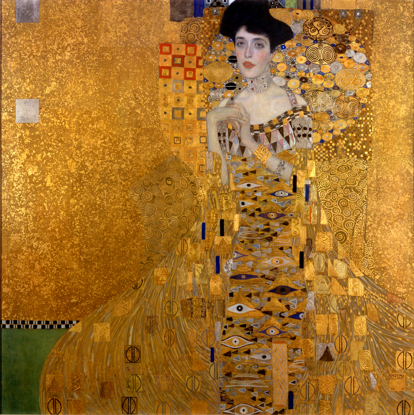
Recently, I saw the movie, “The Woman in Gold,” about the painting of Adele Bloch-Bauer by Gustav Klimt. I’m sure most of you know the story behind this amazing painting. If not, see the movie or read the book!

In brief, this glorious painting, was finally returned to Adele Bloch-Bauer’s niece after it had been stolen by the Nazis and kept in Austria. She then sold it to Ronald Lauder for $135 million. It now hangs in the Neue Gallery in New York, where everyone can enjoy it.

Although Klimt knew his subject well, he chose to portray her in his symbolist style. Her beautiful face is dreamy and arresting, but the rest of the painting is an amazing design, rendered exquisitely in oil paint and gold leaf, with many patterns in her dress and on the wall behind her.

I started thinking about how the female figure has always inspired artists, since the very beginning of visual art. While we can appreciate the classical depictions of women, it’s interesting to see how artists have interpreted this subject differently.

In Your Dreams
Jacqueline Rochester
Looking though the works of Wilde Meyer artists, I see that there are just a few who paint the female figure. (Many prefer dogs, horses or cows!) Jacqueline Rochester, one of the gallery’s older artists, is deceased, but several of her paintings are still handled by Wilde Meyer. I’m particularly drawn to them because I see the influence of Matisse, and, like me, she portrays inviting places where you’d like to be. The figure is important, but it’s not the only interesting part of her work.

In her biography, she said, “My paintings are a word of youth, a secret world of leisure and play, of lovely places…It’s a world apart from today’s realism and society’s struggles.” Her painting entitled “In Your Dreams” is a good example. The well-dressed figure is looking out pensively, and behind her are the elements of a cozy home: colorful rugs, part of a chair, dogs and a rocking horse. Although these elements are not arranged in a traditional way, we can understand the story. The open composition style and the way she shows only part of most objects makes the painting more interesting to me.

White Orchids
Jacqueline Rochester

“White Orchids” is another painting that reminds me so much of Matisse because of its flat perspective and the simple rendering of the two women with just solid shapes and no worries about shading or small details. It’s another inviting scene, with many allusions to women: a domestic setting, and the feminine touch of flowers in the bowl, on a pillow, in a woman’s arms and on the wall (a painting which reminds me of Georgia O’Keefe -- a feminist!).

The Good in Everything
Andrea Peterson


Andrea Peterson, a young artist at the gallery, sees painting the female figure as a way of expressing herself. She says that the imagery she presents is an extension of her dreams. “The Good in Everything” is indeed a woman’s story. Andrea explained that the coy fish represent luck and prosperity; the white flowers are purity and goodness. Her loose painting style in this work help to convey the sense of floating through a dream.

Andrea’s women are portrayed in many different ways. The figure in “The Rider” is completely different; she looks determined and commanding as she leads her horse. Her dress is modern, even a little sexy for a horse rider (maybe her pants are in the barn). Then, in another style, Andrea invokes her inner Degas in the painting entitled “Corps de Ballet.”   She said, “In this painting, I was working with composition, focusing on the body poses. I liked showing the back view of the dancers, making them anonymous, and thus asking the viewer to think about their expressions.” The beautiful pastel hues and Andrea’s painterly brushwork for the background give the work great energy. The dancers look as if they just finishing twirling!
Corps de Ballet
Andrea Peterson
The Rider
  Andrea Peterson
The women in Linda Carter Holman’s paintings are stylized, with curvy shapes and glowing, innocent faces. Like Jacqueline Rochester, they are part of a story, a quiet life in the Southwest. Her use of bold color and small details on the objects that complete each painting make her work very appealing. The artist takes a simple act or seemingly mundane task, and makes it interesting. Linda has design elements that are symbolic to her and make their way into many of her works. The Calla lilies in the woman’s arm and the goldfish on the pot in “Little Winds” are an example of recurring themes. The woman in the foreground is touching the soil, but seems to be ready to take off and join her two friends as they fly away.

Little Winds
Linda Carter Holman
 
In “Loving Cup,” a bride offers a cup that has attracted two colorful birds. Her white gown and headdress seem to be carrying her aloft. She almost looks swan-like to me. You can see the goldfish again on the drink sticks in the foreground and on the vase in the background holding the calla lilies. There are other things going on in this painting: one woman shoots an arrow into the sky, while another looks on. There are shooting stars in the sky. These women are telling us a story about an event, something that triggered Linda’s creative mind.

Loving Cup
Linda Carter Holman
 
The female figure is often a thought-provoking focal point in a painting. Not too many are as dramatic as Klimt’s portrait of Adele Bloch-Bauer. I plan to have a good look at this famous work, when I visit the Neue Gallery in New York next week!

You can see more art by Jacqueline Rochester, Linda Carter Holman and Andrea Peterson at Wilde Meyer Gallery.