Showing posts with label Albert Scharf. Show all posts

Where does your eye go?

The power of the horizon line

By Judy Feldman | www.wildemeyer.com

A few weeks ago, while driving up to Flagstaff, I felt as if I were enveloped in a mass of fluffy grey clouds. It was pleasant, and yet, disconcerting. Something was a little off, and I realized that it was because from my perspective, the horizon was so low. My view was all about the sky and its atmospheric effect.

Landscape #715
50" x 60" oil on canvas
 Albert Scharf 
Painters use horizon placement as a technique to convey their story. It can orient the viewers to where the artist wants them to be. A low horizon, like the “cloudscape” I saw, suggests a deep, open space; whereas a high horizon places the emphasis on the foreground. If the horizon is basically in the middle of the canvas, then the eye will be drawn more to color and shapes.

Landscape 802
54" x 42" oil on canvas
 Albert Scharf 
When I was pondering the low horizon line, I immediately thought about Albert Scharf, a Wilde Meyer artist who lives in Santa Fe. Looking at Albert Scharf’s beautiful cloud paintings, you can really sense the vastness of the sky I was feeling myself. When I spoke with him, he said that he finds that clouds are an interesting subject because of what they do to the light, and since they have abstract shapes, he’s not bound by form or structure.

“Clouds have an amorphic shape that enable me to pursue my interest in the emotional content of color,” he said.  “Also, the manipulation of their hard and soft edges gives great energy to the paintings.”


At first, Albert just painted clouds, but he then decided to add the thin slice of land below as a counter balance which, he noted, makes the sky look even larger. This is the effect of the low horizon that intrigues me. You can see how this happens in Albert’s painting entitled “Landscape 802.” (Yes, he numbers all his paintings.)  In “Landscape 715,” he has increased the size of the ground and textured it with a palette knife, which separates the land and sky and gives the painting a completely different look.

Landscape 852
60" x 48" oil on canvas
Albert Scharf 
Although he has seen many beautiful Santa Fe skies in the 30 years he has lived there, Albert does not use local color; rather he prefers to present his ”skyscapes” in analogous saturated hues that transcend through the conscious into the subconscious. “I want to take my viewers to a place where they feel good,” he said. A great example of this technique can be seen in “Landscape #852,” where the sky bursts with hues of pink, gold and violet.

On the other hand, Larry Taylor’s interest lies in the beautiful gardens he paints, so he purposely keeps his horizon line high. He says that it’s his personal preference, “just the way I look at the scene.”
The Well Traveled Path
 35" x 35" oil on canvas
Lawrence Taylor

Since the 1980s, Larry has made periodic trips to England and Wales, visiting the gardens of the British National Trust. The photographs he takes on site are used for inspiration in his paintings. In his work entitled “A Quiet Place,” Larry leads the viewer’s eye up the steps to the horizon, and along the way, we are treated to a gorgeous display of red tulips, purple irises and mounds of golden hued flowers. I just want to walk right into the scene!

Quiet Place
40" x 44" oil on canvas
Lawrence Taylor

“The Well-Traveled Path” is another example of Larry’s technique of getting the viewer to travel from the foreground to the end of a path near the high horizon. His clusters of blooms vibrate with color. Although our eyes are initially attracted to the brilliant red flowers in front, we still want to go up the path and see what’s going on at the house in the background.

Is horizon line placement always important to create drama? Not necessarily. Judy Choate is more interested in perspective and balance when painting her stylized landscapes. The excitement in her work comes from the brilliant colors and somewhat abstract shapes she uses to convey her impressions of the mountains of the Southwest. Judy has observed their interesting formations for years, while living in Sedona, on driving trips, and, now near her home in Tucson.

Approaching Storm
 48" x 60" acrylic on canvas
Judy Choate 
In her large (48”X60” painting entitled “Approaching Storm,” the horizon is actually in the middle of the scene. She catches our eye in a different way, by painting dark shapes in the foreground as a foundation, describing the mountains in warm pure hues in front and in more opaque colors behind. The slash of deep blue defines the horizon and adds more depth. Then our eye goes up to the whirling shapes of the sky.

Judy often lets the shape of a canvas determine her design. For example, in “Approaching Sunset,” the 20”X60” format dictates a wide-angle view of the mountains. We see a piece of the horizon line behind the golden shapes, where the sky swirls upward.

Approaching Sunset
20" x 60" acrylic on canvas
Judy Choate 
Some artists do away with a horizon line altogether. But, that’s another story, another blog!

You can see more work by Albert ScharfLawrence Taylor, and  Judy Choate at Wilde Meyer Gallery.


Art and Spirituality

By Judy Feldman | www.wildemeyer.com

Is there a special relationship between art and spirituality? There are many reasons to think so. Art and traditional religions have always been linked – some of the greatest paintings and sculptures have had religious themes.

I think artists have always striven to express something that’s beyond the material. The “language” of art can be an emotional reaction to a beautiful landscape, a completely conceptual piece that conveys a personal message, or an image that tells a story of importance to the artist. Often, there’s a spiritual component.
Ghost Shirt series #4  61"x61"
by Jim Nelson
  There are two artists at Wilde Meyer who express spirituality in very different ways. 
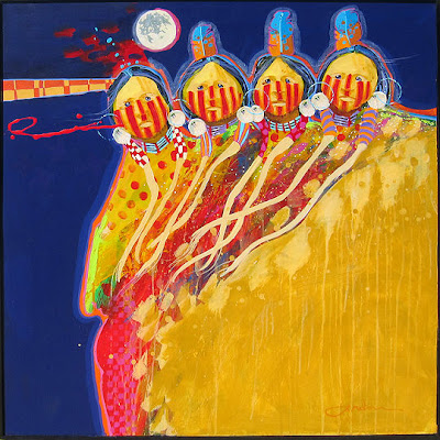
Jim Nelson is a painter and storyteller of legends of the Lakota tribe of South Dakota. Although he is not of native heritage, Jim grew up near the Pine Ridge reservation and was friends with Lakota children. Their culture became part of him, and he has always painted their stories. Everything in Jim’s work has a meaning, expressed through vibrant colors and symbolism. He says, “I don’t just paint a person or an animal. I paint the spirit of that person or animal, and hope that the viewer will gain an understanding of this people and their culture.”

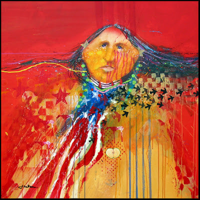
According to Jim, four primary colors represent the four sacred beings of the Lakota. Red is the highest spiritual color; blue represents the wisdom of the Sky Father; green is the Earth Mother; and yellow is the color of rocks in high places that overpower anything that stands next to them. When you look at Jim’s work, almost all paintings include these strong colors.

Paint Their Face Red 30.5"x30.5"
by Jim Nelson
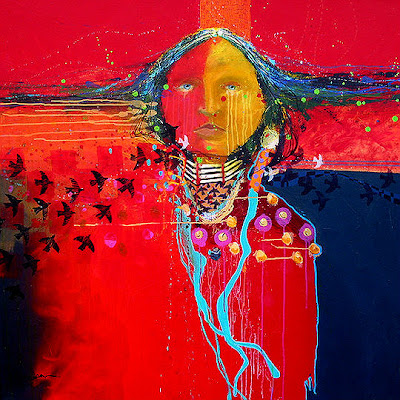
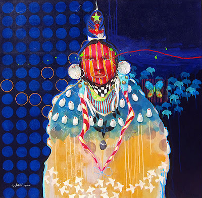
For example, in the painting entitled “When Ravens Call to Her,” red is the dominant color, indicating the high spiritual nature of the woman, who has the souls and spirits of soldiers killed in battle, brought to her by the ravens who are pictured flying across her body. Jim says that these spirits are then given to the Grandfather of the North Wind (indicated by the deep blue), who puts them in the northern lights in what is called a “shadow dance.” If the eyes of this woman seem very compelling, it’s probably because Jim begins every painting with the eyes of his subject and, he says, they pull him in and dictate the course of the imagery. All of his faces are deep in thought because they are telling an important story.

When Ravens Call to Her 48"x48"
by Jim Nelson
 There are many other symbols in “Bird Woman,” which depicts a healer of battle wounds. Her striped face means that she’s been touched by a grizzly bear and has his protection. The butterfly symbolizes a messenger from the Earth Mother who teaches the healer her ways. The circles on the left side of the painting represent the lodges where the tribe once lived, and the deep blue background again connotes the wisdom of the Sky Father.

Bird Woman 36"x36"
by Jim Nelson
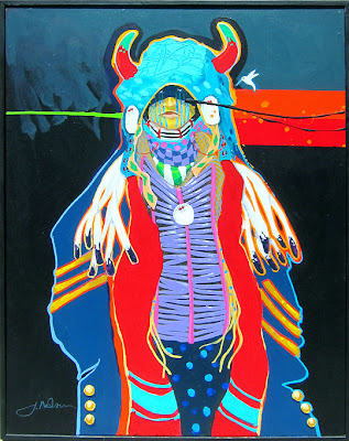
See the Medicine Hat 31.5"x26.5"
by Jim Nelson
I asked Jim about the image of the American flag, which appears in the painting entitled “Blackbird's Day.” He said it refers to the encroachment of the white man on the Native Americans’ lands. This painting, too, has a very strong message, which is seen in the eyes of the subject; the use of the important four colors – especially red – and the symbols. The latter appeal to us because of their decorative design, but they mean so much more, once Jim explains their significance. You can certainly appreciate his work on a purely artistic level, but when you probe and learn the spirituality beyond it, these paintings become so fascinating!

Blackbird's Day 30.5" x 30.5"
by Jim Nelson
Albert Scharf takes spirituality in another direction. His series of new paintings are inspired by the Kabbalah, the study of Jewish spirituality and mysticism. Albert says about these paintings: “I think of these pieces as meditation plaques. The Hebrew letters are like antennas to me; they make me think about things that I don’t normally contemplate. The letters also have a sound that can be chanted as a meditation.”

Left: Ayen Shin Lamed mixed media on canvas 20"x16"
Right: Mum Lamed Hey oil and sea shell mixed media on canvas 16"x20"
by Albert Scharf
As I said before, spirituality and art are connected. Albert’s Kabbalah-inspired paintings, such as “Ayen Shin Lamed” and “Mum Lamed Hey” are pleasing to look at, but they invite us to go deeper and pursue their meaning.

Landscapes #704 and #705 diptych
24"x24" total
by Albert Scharf
So, to learn a little about Kabbalah, I went to the website “Judaism 101.” Here is part of the explanation on the site: “According to Kabbalah, the true essence of G-d is so transcendent that it cannot be described, except with reference to what it is not. This true essence of G-d is known as Ein Sof, which literally means "without end," which encompasses the idea of His lack of boundaries in both time and space.

I still didn’t understand the definition, so I went to www.kabbalah.info.com. Here, it was stated: “In simpler words, there is an upper, all-inclusive force, or “the Creator,” controlling everything in reality. Some of these forces are familiar to us, such as gravity or electricity, while there are forces of a higher order that act while remaining hidden to us. Kabbalah holds the map or the knowledge of how these hidden forces are structured, and the laws by which they influence us.”

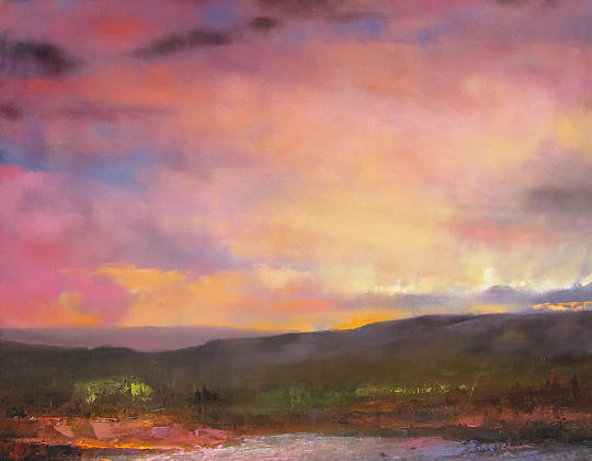
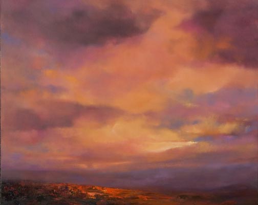
Albert also expresses his spirituality in his cloud paintings series. He says that he sees clouds as the transition state from land to the sky. “Spiritual energies are transmitted to us through the clouds. Their light affects our moods.”
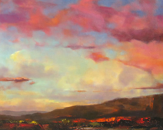
Landscape #715 50"x60"
by Albert Scharf
 As you can see in “Landscape 715” (yes, he numbers his paintings and has done nearly 800), the clouds pull us into the painting and encourage us to go to a meditative place. “Landscape 682” also conveys the importance of color to Albert. He does not use local color, but prefers to select saturated hues that he says are the emotional content of his art. “If I can get people to experience an emotion, they can raise their consciousness to a higher level.”

Landscape #703 48"x36"
by Albert Scharf
You can see more art by Jim Nelson and Albert Scharf at Wilde Meyer Gallery.

High and Low


The Dramatic Effect of the Horizon Line (and what happens when it’s not there…)

Claude Monet "Water Lilies" (Source: Wiki Commons)

During a visit to Paris last September, I spent several hours at the Orangerie museum. That’s where Monet’s amazing water lilies mural paintings are displayed. There are four walls of murals, which were painted on canvas and then affixed to curved walls. Each mural is 41 feet long and more than six feet tall. The visitor is invited to sit and contemplate these tranquil images, designed to “offer an asylum of peaceful meditation at the center of a flowery aquarium.”

What I noticed is that these paintings seem to pull the viewer in, to embrace you in such a way that you feel as if you are right on top of the pond, and almost inside it. I wondered whether the lack of a horizon contributed to this sense of no spatial limitations.
Some of the artists here at Wilde Meyer have created that sense of being pulled into their painting by omitting a horizon, or by placing it in a particular way.


Robert Charon’s “Koi Pond II” evokes the same feeling to me as Monet’s water lilies. I’m drawn into the pond, as he creates a wonderful illusion of depth, with the dark outlined stones at the bottom, the bubbles on the surface and the koi floating through them. This painting calls for reflection, too.

Koi Pond II mixed media on panel with resin varnish 24"x36"
by Robert Charon

In some of his other work, Robert creates a different mood by changing his horizon line.

Sunset II acrylic on panel with resin varnish 12"x16"
by Robert Charon


“Since the horizon line gives the viewer a focal point, its placement depends on the subject matter,” he said. “In ‘Sunset II,’ the horizon is low, since I wanted the majority of the painting to be the sky. By showing the sunset as the lightest hue near the horizon line, and painting deeper hues above it, I can create the glow of the sunset.”

Through the Reeds acrylic on panel with resin varnish 12"x36"
by Robert Charon

Mini Distant Trees 6" x 6"
by Robert Charon
In his work entitled “Through the Reeds,” Robert actually has two horizon lines – the line where the reeds meet the water, and the small line where the reeds part, to reveal the trees behind them. The technique of this narrow 12”X36” painting is pretty amazing: my eye focuses first on the reflection of the reeds on the water, and then travels far in the distance. It’s a painting that holds my attention!


A small piece, called “Mini Distant Trees” also is interesting. The horizon line is almost in the middle, indicated by small trees. The pale sky takes your eye back, but the swath of red in the foreground is arresting. It’s a soothing painting, and yet, it’s not.

Robert Anderson, another Wilde Meyer artist, also changes his intentions, between abstract and landscape paintings. In his large work entitled “Floating in Time,” as well as “Clarity, Movement and Light,” Robert wants to “draw viewers into the painting, and keep them there.”

Floating in Time oil on canvas 96" x 72"
by Robert Anderson
Clarity, Movement, and Light oil on panel 24.5" x 24.5"
by Robert Anderson


When he’s doing landscapes, he favors a high horizon line, since he is interested in showing distance.
“With a high horizon, I can create a more dramatic vista,” he said. “The deep foreground gives me more space to show the relationship between the flowers and plants I’m focusing on, and the trees and mountains in the far distance.”
Summer Sunflowers oil on panel 33.5" x 31"
by Robert Anderson

You can see an example of Robert Anderson’s technique in “Summer Sunflowers.” The large flowers in the foreground seem even larger when contrasted with the receding background, with its much smaller flowers and trees. The intensity of the flowers’ hues also brings them forward to us, while the small line of sky seems to blend in with the soft shades of the background.


“Summer Blue,” a large 46”X66” painting, is another work with just a sliver of a horizon line at the very top of the painting. It’s quite faint, but it still helps to give the viewer the illusion of depth. Robert’s interest is obviously the field of flowers, but it wouldn’t be nearly as effective if he didn’t include the small trees and hills behind them and the little strip of pale blue sky.


Summer Blue oil on panel 46" x 66"
by Robert Anderson
A very low horizon line has the opposite effect. If you look back at the post I wrote on August 16th about Albert Scharf’s cloud paintings, you see how he uses the thin slice of land below the clouds as a counter balance which, he noted, makes the sky look even larger.

Landscape 618 oil on canvas 30"x40"
by Albert Scharf

So you see, the painterly intent of the artist is often tied into the placement of the horizon line and can really elicit certain emotional reactions to a work. What do you prefer?  Let us know in the comments.


Landscape: A Personal Vision


I just returned from a wonderful trip to Santa Fe. I was struck by the stark beauty of this area, and how much sky one sees there. At times, the sky takes over nearly the entire field of vision, and the ground is just a small sliver underneath. Just driving there on 1-40, I noticed how the very low horizon changed my perception. I felt surrounded by the large, billowy clouds. That’s an idea I’ll pursue in another post.


It’s easy to understand why so many artists who live in Santa Fe choose to paint landscapes. Albert Scharf and Fran Larsen exhibit their work at Wilde Meyer. Both interpret the landscape differently.

Landscape #616 oil on canvas 40"x30"
by Albert Scharf

Looking at Albert Scharf’s beautiful cloud paintings, you can really sense the vastness of the sky I was feeling myself. When I spoke with him, he said that he finds that clouds are an interesting subject because of what they do to the light, and since they have abstract shapes, he’s not bound by form or structure.

“Clouds have an amorphic shape that enable me to pursue my interest in the emotional content of color,” he said. “Also, the manipulation of their hard and soft edges gives great energy to the paintings.”

High Desert Mountains 30"x30"
oil on canvas by Albert Scharf
At first, Albert just painted clouds, but he then decided to add the thin slice of land below as a counter balance which, he noted, makes the sky look even larger. This is the effect of the low horizon that intrigues me. You can see how this happens in Albert’s painting entitled “Landscape 616.” (Yes, he numbers his paintings and has done nearly 800.) In “High Desert Mountains,” he has increased the size of the ground and given it texture with a palette knife, which gives the painting a completely different look.

Landscape 576 oil on canvas 48"x60"
by Albert Scharf
Although he has seen many beautiful Santa Fe skies in the 30 years he has lived there, Albert does not use local color; rather he prefers to present his ”skyscapes” in saturated hues that transcend through the conscious into the subconscious. “I want to take my viewers to a place where they feel good,” he said. A great example of his wonderful use of color can be seen in “Landscape #576.”


Companion Paintings 24"x96" (diptych)
by Albert Scharf
Lately, Albert has created several “companion paintings,” which involve two or more pieces that have similar landscapes, but one is in warm tones and the other cool. When hung together, they look like reflections of each other.


Although Fran Larsen has lived in Santa Fe for many years, she grew up in Michigan, where she spent time with her uncle, who was a glacial geologist. “We talked quite a bit about geology and the anthropology of the old tribes who lived in the areas we visited,” she said.

South from Beyond  28"x60"
by Fran Larsen

When she moved to New Mexico, she was thrilled by the wonderful light there, the amazing geologic forces that created the landscape and the interesting cultures of its residents. Fran says that her paintings are metaphors of her reaction to these unique New Mexican characteristics.

Dawn Passage 13.5"x13.5" by Fran Larsen
“I am inspired by the way the environment makes me feel,” she says. “Because of the intense light here, I see color in entirely different ways than I did in Michigan. Once color becomes arbitrary – rather than local – shapes can be arbitrary as well.” As you can see in “Dawn Passage,” Fran picks her own colors for the mountains, sky and houses, and creates a more stylized vision of the landscape.

Like Albert Scharf, Fran Larsen paints her personal experience, rather than an actual depiction of what she sees. She prefers to paint her reactions to a scene – “what it creates in me” – which helps her remove the “horse blinders that make us see things so literally.” Many of her paintings feature a road that winds through the mountains - - such as “Take the High Road” and “Deep in the Canyon.” Perhaps that symbolizes the journey that she has taken with her art in Santa Fe.

Take the High Road 24" x 28"
by Fran Larsen

Deep in the Canyon 22" x 26"
by Fran Larsen
 
There is another unique element in Fran’s paintings – the frames themselves. She designs, constructs and paints each frame to complement the painting. “The frame reasserts that the painting is an object as opposed to a representation,” she says.
 

Early Dawn, Arroyo and Mesa 38" x 22"
by Fran Larsen