Big and Small

Can you think big and still paint small?

It’s time again for Wilde Meyer’s annual Gem Show, the show of smaller paintings by many of the gallery’s artists. For most of us, this is a change from our regular formats, and small paintings present their own challenges.

When I started thinking about my own paintings, large and small, and looking at some of the other participating artists, I began to consider that we tend to keep our same style and subject matter, but we have to make some changes to succeed in this smaller context. 

Time for a Walk, 11.5"x14.5" by Judy Feldman
Time for a Walk 11.5"x14.5" oil on canvas
by Judy Feldman


I love to paint interiors. I just finished one called “Interior with Red Chair.” But I couldn’t just shrink it! In my Gem Show painting, entitled “Time for a Walk.” I think I conveyed feeling of an inviting place, but with fewer elements. And, of course, the dog got smaller (by walking off the canvas!) With “A Christmas Surprise,” I purposely created a small image, focusing mainly on the new puppy in the box.

Bandit 4"x4" acrylic on canvas
by Ryan Hale
Ryan Hale finds small paintings challenging in a different way. Since he is an abstract artist, he likes to work freely and intuitively.

Ryan likes to interpret patterns of aerial views of landscapes. He’s fascinated by how land is divided, especially when seen from above, where civilization and nature both co-exist and collide. You can appreciate his intentions in these larger paintings entitled “Daily Intervals,” which measures 60”X72”, and “The Forming Earth,” which is 36”X36.”

So, when it came time to do some 12”X12” paintings, Ryan decided to work on several at once, so they would be related and could be hung together in different orientations. While he was painting them, he would move them around. “It’s a challenge, like creating a puzzle,” he said. “I takes a lot of thought to get a strong enough image on a small canvas.”

Structure IV 12"x12" acrylic on canvas
by Ryan Hale
I think these two small paintings, entitled “Structure III" and "Structure IV" are very successful. They reflect Ryan’s considered style and thoughtful color selections, and work well as a single unit or together. He also included a figurative painting, “Bandit,” which probably comes from another part of his creative brain!
Structure III 12"x12" acrylic on canvas
by Ryan Hale

Along the High Road oil on canvas 26"x41.75"
by Leigh Gusterson
Leigh Gusterson does beautiful expressionist paintings of the landscape around her Taos, New Mexico home. Often, a blue truck is driving through the vibrant scene, with a dog hanging out the back, such as “Along the High Road” (26”X41.75”) and “Fall Showers” (27”X27”). Her colors are delicious!
 
Taos Mountain Sunset  6.25"x9.25"
by Leigh Gusterson
Glorious Tree in Pilar 5.25"x9.25"
by Leigh Gusterson
Leigh also shares her love of the New Mexico landscape in her small paintings, but on a more intimate scale. In “Glorious Tree in Pilar,” we see Leigh’s truck journeying through the road, but we’re closer, and the flame red tree just pulls us into the 4”X 8” painting. I’m really impressed with “Rancho Sheep.” Leigh gets so much information in a tiny 4”X6” format, all in perfect proportion. “Taos Mountain Sunset”, a 5”X 8” painting, gives us the full beauty of the scene, yet we do feel closer to it than when we view her larger work.


Gem Show 2012
Gem Show 2012

You might be a bit overwhelmed when you see the wall of small paintings at the Gem Show. But it’s worth taking the time to look carefully, and ask Laura, Ryan or Jonathan to show the ones you like by themselves. It’s challenging to paint small, but the result is really a “gem!”

Gem Show 2012, miniature paintings
Gem Show 2012

All In the Family


Desert Companions 10"x12"
by Roger Alderman
I’m still thinking about the possibility of an “art gene,” since I discovered that there are two sets of siblings who exhibit their work at Wilde Meyer.

Although their parents were not fine artists, Roger Alderman and Acacia Alder probably do have the art gene. According to Acacia, her family loved “making things” for their 100-year-old home, such as furniture and crafts, and they appreciated beautiful surroundings.

“Our house was always buzzing with a project,” she said. “Our parents felt that you should have a personal relationship with your environment, and a belief in yourself that you could make things. They felt that if you could put trust in your hand and your brain, and if your heart was in it, you could succeed at making something.”

Seen Its Better Day  9" x 12"
by Roger Alderman
Roger remembers visiting the Cleveland Museum of Art as a child, and being “knocked out” by what he saw. He later studied Industrial Design and Fine Art at The Ohio State University, Columbus, Ohio. He’s also studied studio art at the Pima Community College, the Tucson Museum of Art School, and The Drawing Studio, in Tucson, Arizona. Roger has developed his own unique painting style through years of painting and drawing, using bold colors and expressive palette knife work. He often paints outdoors, in the areas around his Tucson home.

“’Cloud Burst’ depicts the summer build up of clouds we get in the Tucson area during the monsoon season,” he says.
Cloud Burst 30"x40" oil on canvas
by Roger Alderman

“Desert Charmer” was inspired by a visit to the Saguaro National Monument during the spring, when the hillsides are carpeted with yellow flowered Brittlebush. 
Desert Charmer 31.75"x 37.5" oil on canvas
by Roger Alderman

Sundown by Roger Alderman
Acacia Alder also has a contemporary view of the landscape, but she prefers to paint in her studio. Although you can appreciate her love of the outdoors, her paintings are quite stylized.

Golden Light by Roger Alderman
For example, “Sundown” and “Golden Light” both depict the Aspen trees, yet Acacia paints their trunks, rather than the leafy tops, focusing on the unique bark of these trees. They’re outlined in red and black, which makes the trees “pop” against their background. In “Sanctuary at Purgatory Chasm,” the trees, rocks and mountains again have that outlined style, which gives the painting a modern, interesting look – and a little like stained glass. Acacia says she has been influenced by Van Gogh and Cezanne. I think you can see that in her work!
Sanctuary at Purgatory Canyon 60" x 40" acrylic on canvas
by Acacia Alder
The Pendleton sisters have a wonderful collaboration going that produces mixed media pieces in paint and glass. Sandy Pendleton says that her father was a carpenter and made a living with his craft. But it was her grandmother who loved art.
Amber Sunset 12" x 36" triptych
by Sandy Pendleton
glass panels

“She did china painting, greenware ceramics, quilting and made dolls,” Sandy said. “Whenever we’d visit her, she’d always have an art project for us to do.”

Celestial Geode 12" x 15" x 2" plus base
by Sandy Pendleton
Sandy liked to make things, but she followed her interest in math and science to have a career as a programmer and project manager with IBM. When she retired, she started working with glass. “I think I like this medium because it requires some technical knowledge, in terms of chemistry and temperature control. And, it’s so much fun to experiment!” “Celestial Geode” looks like it took quite a bit of experimenting to achieve this interesting piece. “Amber Sunset Bowl” almost looks like ceramics, but it has the beautiful iridescence of glass


Nancy Pendleton, Sandy’s sister, has always loved art, drawing as a child, and, later on, obtained a BFA in graphic design. While she was working as an illustrator, she also pursued her interest in fine art, first in figurative images, and now in an abstract style. She loves mixed media, and started using handmade paper, with acrylics and natural objects. Her painting entitled “Studio Recycles Red” is a good example of her skill with different materials.
Sweet Spot 15"x10"
by Nancy Pendleton and Sandy Pendleton


Studio Recycles Red 14" x 18"
by Nancy Pendleton
When her sister became proficient in making art glass, the two decided to work together.

“We’ve worked out a technique,” said Nancy. “I often use a centerpiece in my art, and Sandy came up with glass pieces that work well in my paintings.” You can see examples of this sibling collaboration in “Bursting” and “What You See Is What It Is,” as well as some charming dog paintings such as “Sweet Spot” and “Flirting with Fido.”
 
Bursting 60"x48"
by Nancy Pendleton and Sandy Pendelton


What You See Is What It Is 24"x24"
by Nancy Pendleton and Sandy Pendleton

So, maybe there is an art gene! And, as Acacia said, it can just be that love of making things that’s passed on from one generation to another. What a gift!

Play with Me  15"x10"
by Nancy Pendleton

An Art Gene


Afternoon in Provence 36"x48"
 by Judy Feldman
I recently returned from a trip to New York City to attend the opening of a sculpture exhibit at the Affirmation Arts foundation. The show’s artist is my brother, Jeffrey Maron. His work is very different from mine, but I think we were both inspired by our mother.

Sculptures by Jeffrey Maron
At the reception dinner, I asked him if he thought there was an “art gene.”

Cleo on the Deck 40"x30"
by Judy Feldman
Sculpture by Jeffrey Maron

“Well, he said, we were both exposed to art at home, since Mom was an artist who taught classes in the house and exhibited her paintings there. Plus, she always took us to museums and encouraged our interest in art.”

Jeff became an artist long before I did, and our mother was always so proud of his work. (My father, a lawyer, struggled with his lack of a regular job!) When I started painting, I think all the information I had absorbed from my mother flooded my brain and propelled me to follow that artistic path.  I noticed that there is another artist at Wilde Meyer whose mother is a well-known artist. So, maybe there is an art gene!

Significance 40" x 60"
by Gregg Rochester

The Present 41" x 41"
by Jacqueline Rochester
My conversation with Gregg Rochester confirmed my theory. Gregg is a psychologist who became a professional artist. His mother, Jacqueline Rochester, painted until a year before she passed away, at 87. Her work continues to be shown by Wilde Meyer. Gregg told me that when he was 16, his mother took him and his brothers to Mexico for four months. “She painted, and I took up the craft of silversmith and learned to play the classical guitar,” he said. “That time spent in another culture really affected me.

My mother didn’t actively encourage us to be artists. Two of my three brothers are writers, and the third is an educator. I pursued a psychology career, and when I began painting, I was afraid to show my mother my work, thinking she would be critical. But, she was actually very supportive, and she pushed me to paint in a larger format.”

Gregg’s work focuses on the landscapes he has seen and loved. They are not a realistic rendition; rather a contemporary vision of his landscape memories. He says, “I seek to convey the eloquence and the art of the land and sky in my work, to bring a touch of it inside our living spaces so that it can remind us of our wholeness, to bring us back to what is right.”

Another Realm 46"x40" oil on canvas
by Gregg Rochester

In Gregg’s large painting entitled “Another Realm,” he interprets the rolling Wisconsin hills in his own fashion, portraying them graphically, with strong hues and interesting textures. “Another Life” is a more southwestern image, with desert plants in the foreground, the high color of the sun in the midline and the sunlit mountains in the background. (Although this painting is essentially divided into thirds, I think it’s very effective.)
Another Life 48" x 48"
by Gregg Rochester

“A Thousand Whispers” could be many different places, even one in your imagination. The path of colored stones leads us to an unknown destination; the viewer can feel the warmth of the sun on the flowered field and the sounds of whispering insects.

A Thousand Whispers 48" x 48"
by Gregg Rochester

So, can you be an artist, even though you don’t think you have the art gene? Of course! I believe that as long as you have the interest and willingness to pursue a passion, you’ll succeed. Gregg Rochester agrees, and says that anyone can make art at any age, as long as you find what you love and incorporate it into your art. We have so much beauty surrounding us in Arizona, it’s easy to be inspired.

Andrea Peterson at "Paint Out"

Shady Baby by Andrea Peterson
Shady Baby 14"x16" oil on canvas
by Andrea Peterson
In the style of an old Western shootout, Main Street will be closed to traffic for a “Paint Out” event on Saturday, November 10, from 10:00 a.m. to 12:00 p.m. Thirty artists will use paints and brushes (instead of guns) to create a work of art. Andrea Peterson, a Wilde Meyer artist, will participate and represent the gallery.

"I’m so excited to participate in this awesome event, and I'm planning to start and complete a small burro piece with an abstract red background,” she said. Andrea has done several charming burro paintings, including “Shady Baby,” “Three’s a Charm and “Sunny Days,” so it will be interesting to see her complete a smaller one in such a short time.
Three's a Charm by Andrea Peterson
Three's a Charm 20"x20" oil on canvas
Andrea Peterson
Sunny Days by Andrea Peterson
Sunny Days 30"x40" oil on canvas
Andrea Peterson

Right after Andrea and the other artists finish their pieces at noon, they will be auctioned off to the public. So come by and enjoy this fun event, which is part of Scottsdale’s “Fall for the Arts” weekend.

You can get more information by going to this facebook site created by Wilde Meyer:
http://www.facebook.com/events/187653641359390/ 

Correction: This event was originally listed as "Quick Draw". The event is now called "Paint Out".

High and Low


The Dramatic Effect of the Horizon Line (and what happens when it’s not there…)

Claude Monet "Water Lilies" (Source: Wiki Commons)

During a visit to Paris last September, I spent several hours at the Orangerie museum. That’s where Monet’s amazing water lilies mural paintings are displayed. There are four walls of murals, which were painted on canvas and then affixed to curved walls. Each mural is 41 feet long and more than six feet tall. The visitor is invited to sit and contemplate these tranquil images, designed to “offer an asylum of peaceful meditation at the center of a flowery aquarium.”

What I noticed is that these paintings seem to pull the viewer in, to embrace you in such a way that you feel as if you are right on top of the pond, and almost inside it. I wondered whether the lack of a horizon contributed to this sense of no spatial limitations.
Some of the artists here at Wilde Meyer have created that sense of being pulled into their painting by omitting a horizon, or by placing it in a particular way.


Robert Charon’s “Koi Pond II” evokes the same feeling to me as Monet’s water lilies. I’m drawn into the pond, as he creates a wonderful illusion of depth, with the dark outlined stones at the bottom, the bubbles on the surface and the koi floating through them. This painting calls for reflection, too.

Koi Pond II mixed media on panel with resin varnish 24"x36"
by Robert Charon

In some of his other work, Robert creates a different mood by changing his horizon line.

Sunset II acrylic on panel with resin varnish 12"x16"
by Robert Charon


“Since the horizon line gives the viewer a focal point, its placement depends on the subject matter,” he said. “In ‘Sunset II,’ the horizon is low, since I wanted the majority of the painting to be the sky. By showing the sunset as the lightest hue near the horizon line, and painting deeper hues above it, I can create the glow of the sunset.”

Through the Reeds acrylic on panel with resin varnish 12"x36"
by Robert Charon

Mini Distant Trees 6" x 6"
by Robert Charon
In his work entitled “Through the Reeds,” Robert actually has two horizon lines – the line where the reeds meet the water, and the small line where the reeds part, to reveal the trees behind them. The technique of this narrow 12”X36” painting is pretty amazing: my eye focuses first on the reflection of the reeds on the water, and then travels far in the distance. It’s a painting that holds my attention!


A small piece, called “Mini Distant Trees” also is interesting. The horizon line is almost in the middle, indicated by small trees. The pale sky takes your eye back, but the swath of red in the foreground is arresting. It’s a soothing painting, and yet, it’s not.

Robert Anderson, another Wilde Meyer artist, also changes his intentions, between abstract and landscape paintings. In his large work entitled “Floating in Time,” as well as “Clarity, Movement and Light,” Robert wants to “draw viewers into the painting, and keep them there.”

Floating in Time oil on canvas 96" x 72"
by Robert Anderson
Clarity, Movement, and Light oil on panel 24.5" x 24.5"
by Robert Anderson


When he’s doing landscapes, he favors a high horizon line, since he is interested in showing distance.
“With a high horizon, I can create a more dramatic vista,” he said. “The deep foreground gives me more space to show the relationship between the flowers and plants I’m focusing on, and the trees and mountains in the far distance.”
Summer Sunflowers oil on panel 33.5" x 31"
by Robert Anderson

You can see an example of Robert Anderson’s technique in “Summer Sunflowers.” The large flowers in the foreground seem even larger when contrasted with the receding background, with its much smaller flowers and trees. The intensity of the flowers’ hues also brings them forward to us, while the small line of sky seems to blend in with the soft shades of the background.


“Summer Blue,” a large 46”X66” painting, is another work with just a sliver of a horizon line at the very top of the painting. It’s quite faint, but it still helps to give the viewer the illusion of depth. Robert’s interest is obviously the field of flowers, but it wouldn’t be nearly as effective if he didn’t include the small trees and hills behind them and the little strip of pale blue sky.


Summer Blue oil on panel 46" x 66"
by Robert Anderson
A very low horizon line has the opposite effect. If you look back at the post I wrote on August 16th about Albert Scharf’s cloud paintings, you see how he uses the thin slice of land below the clouds as a counter balance which, he noted, makes the sky look even larger.

Landscape 618 oil on canvas 30"x40"
by Albert Scharf

So you see, the painterly intent of the artist is often tied into the placement of the horizon line and can really elicit certain emotional reactions to a work. What do you prefer?  Let us know in the comments.


Expressionist Landscape Painters:


The World Through Rose Colored Glasses


Question: What kind of world is it when you don’t see black, grey, and brown?
Answer: It’s the world of colorists and expressionist landscape painters.

Desert Oasis 24.5" x 30.5"
by Michelle Chrisman

And what a lovely world it is. I know that personally, I ‘m attracted to high color. The primaries are my friends, and I don’t want much to do with those “sad,” muted colors.

In my last post, I wrote about landscape as a personal vision. I noticed that there are some other landscape painters at Wilde Meyer who express how they feel when they look at a scene, rather than try to reproduce it. These painters feel really good!

Michelle Chrisman does the majority of her painting outdoors in New Mexico. “Part of the enjoyment for me is to be outside, to paint quickly and record my emotional response to what I’m seeing,” she said. “I love to get in the zone, surrounded by nature, and paint alla prima, that is, wet on wet, finishing in one session.” Her painting entitled “Desert Oasis,” shown at the top of this post, is a good example of her fresh style. It’s as if she took in her surroundings and expressed it in just a moment, to say how it affected her.

Michelle is a colorist who “hyper sees,” that is, she sees the hues that make up the local color others perceive. She’s very interested in the effect of light and spectral color, which is defined by Wikipedia as “a color that is evoked by a single wavelength of light in the visible spectrum, or by a relatively narrow band of wavelengths. The spectrum is often divided up into named colors: red, orange yellow, green, blue and violet.”

Kitchen Mesa 24.5" x 30.5"
by Michelle Chrisman


You can see Michelle’s technique and color vision in her painting entitled “Kitchen Mesa.” It was painted at Ghost Ranch, the site of many of Georgia O’Keeffe’s paintings. I like the wonderful reds and yellows she uses to show warmth and light, and the soft violets to indicate the shadow of the rock crevices. The blue/green hue in the foreground really pops against the red tones around it. In addition to strong color, Michelle uses heavy texture with a palette knife to describe her landscape.

“For me, paint is part of the experience,” she said. “I want it to be luscious, to say ‘I’m paint, touch me!’”

Barbara Gurwitz wants to create a sense of place in her landscape paintings. She takes photos and does sketches of the special places she wants to paint. But realism takes a back seat to the expression of how she felt at the time of her visit to the site. “I’m not interested in duplicating the colors of nature,” she said. “I’ve always chosen colors that speak to the way I see the world, which are sometimes different from what you would expect.”

View from the West 24" x 30"
by Barbara Gurwitz

High Country Summer 40" x 60"
by Barbara Gurwitz
When looking at one Barbara’s paintings, “A View from the West,” I know it’s a scene of a southwestern village in the foothills of a mountain range. But her strong, primary colors give this landscape great energy and a charming, folk art quality.

Santa Cruz Autumn 34" x 44"
by Barbara Gurwitz
Barbara also seems to see through rose-colored glasses, and that may be because she uses a red ground under her paintings. “It’s a wonderful neutral,” she said. She leaves the red as negative space in some areas. This is evident in most of her paintings, such as, “High Country Summer” and “Santa Cruz Autumn.” The red under-painting makes everything glow!

When Barbara paints, she often calls upon her spiritual mentor, Vincent Van Gogh (who wasn’t quite as upbeat as she). “I love his willingness to paint as he saw fit, and he’s always been an inspiration to me.”

 Leigh Gusterson learned to paint in New Jersey and was trained in the Hudson River style of plein air painting. “It was grey and humid a lot of the time, and my paintings reflected that weather.” But things changed when she relocated to Taos and experienced the effect of the light there. Now, Leigh loves to push color when she paints on location at her favorite sites.
Hollyhock Morning 9.25" x 12"
by Leigh Gusterson

“As artists, we train our eyes to see shapes, form and color more intensely,” Leigh said. “I like to share what I see with viewers of my artwork.” Even though Leigh uses non-traditional colors (as in “Hollyhock Morning”), she said that her palette is simple, with just 12-14 colors. “I can make anything I want with these colors,” she explains. “And, sometimes, it’s just the awesome New Mexican landscape that displays these amazing colors!” She said the pink cliffs in “Magpie Playground” really exist.


Magpie Playground 17.25" x 21.5"
by Leigh Gusterson

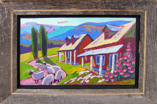
Like Barbara, Leigh enjoys painting scenes of villages nestled in the mountain foothills, with their farms, houses and church. She, too, chooses to wear rose-colored glasses, and infuses some of her work with a sense of whimsy, as in “Drive By Sheep.”

Drive By Sheep 27.5" x 27.5"
by Leigh Gusterson

So, if you’re living in the southwest, take a drive to a favorite spot and look again. You, too, may see some amazing colors you’ve never noticed there before.