We often think of landscape paintings as representational art. But, in fact, many artists are so inspired by the landscape they are experiencing, they prefer to convey these scenes through the lens of their emotions.
I recently attended a lecture by a docent from the Phoenix Art Museum about the Hudson River School. These American painters of the 19th century hiked in uncharted territory of upstate New York, in awe of the wilderness around them. They sketched and wrote their memories on site; then created paintings in their studios that we would call realistic, but which conveyed their fascination with and love of nature.
Today, some contemporary painters express their reactions to a landscape in a different way. They choose to ignore local color and instead, use hues that convey their emotions rather than describe what they see. Others prefer to express themselves with more stylized, abstract versions of physical realities. To explore these different concepts of landscape painting, I called two artists from Wilde Meyer whose work I admire.
When she moved to Santa Fe, Fran Larsen was thrilled by the wonderful light there, the amazing landscape and the interesting cultures of its residents. Fran says that her paintings are metaphors of her reaction to these unique New Mexican characteristics.
“I’m inspired by the way the environment here makes me feel,” she says. “Because of the intense light, I see color in entirely different ways. Once color becomes arbitrary – rather than local – shapes can be arbitrary as well.”
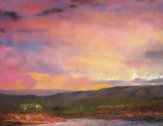
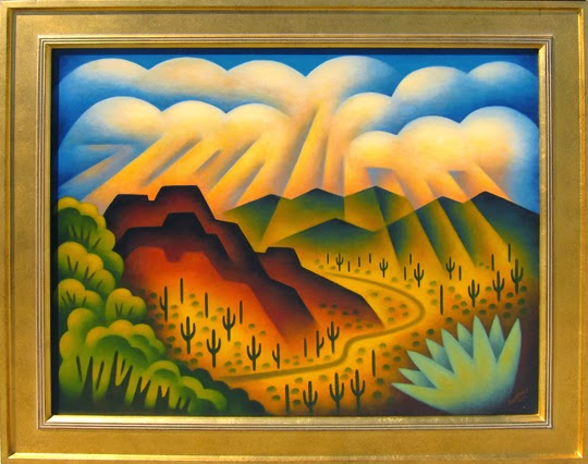
Inspiration for her painting entitled “Dawn Mountain Glow” came as Fran was looking out her window at the canyon below her house. She painted the arroyo that runs through the canyon – a technique she often employs. “Roads and rivers are entry points that take us into things, and I believe that each painting is an exploration for me and the viewer,” she says. As you can see, Fran’s choice of colors is personal, and doesn’t reference the local scene. I sense that her emotional lens was a joyful one – the vivid colors in the canyon and the sky make the painting energetic and pleasing.
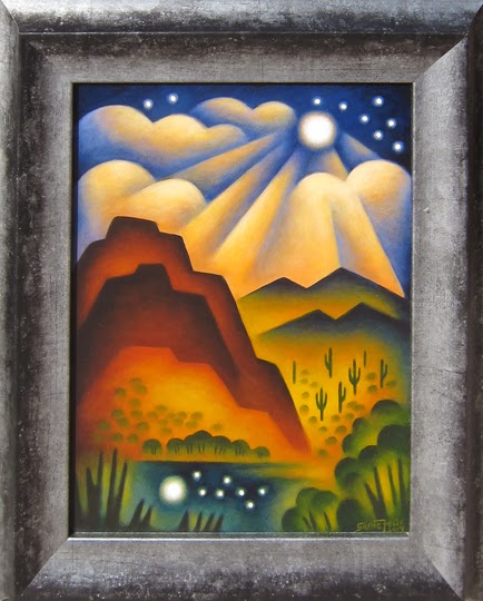
Fran departs from realism in other ways. In her painting entitled “Hidden in the Mountains,” she makes no attempt to portray a three-dimensional depth of field. “This painting is about a landscape, but my interest here is design and the use of flat space – a more cubist approach,” she says. Fran explains that she contrasts light and dark areas, using hues that vary in intensity, to give the painting a “feeling of push and pull.” She uses small dots to enliven the shapes and add texture.
There is another unique element in Fran’s paintings – the frames themselves. She designs, constructs and paints each frame to complement the painting. “The frame reasserts that the painting is an object, as opposed to a representation,” she says.
Sushe Felix lives in Colorado. Her southwest landscapes have a distinctive style, which she claims is derived from her interest in American abstract painters from the 1930’s and 40s, as well as the modernist movement. “In particular, I’ve been influenced by Raymond Jonson, who led the Transcendental Painting Group in Santa Fe,” Sushe explained.
I looked up the group on Google, and found that the aim of the Transcendental Painting Group was "to defend, validate and promote abstract art. They sought to carry painting beyond the appearance of the physical world, through new expressions of space, color, light and design."
Thomas Hart Benton, who was at the forefront of the Regionalist movement, also influenced Sushe, as did the southwest regionalist painters, who took the local landscape and abstracted it. Sushe does that in her own way, with a strong focus on forms, shapes and color. You can see her unique style in two of her paintings, entitled “Sunlit Canyon” and “Late Night Reflection.” She likes to define the shapes of the mountains and sky with sharp edges, but contrasts that with soft shapes inside the borders. When I asked her how she created the delicate areas of clouds, mountains and trees, she said that she uses old brushes to scrub acrylic paint on her canvas to create a pastel-like effect. “I studied pastel in college, so I know how to blend very well,” she says.
Sushe often includes depictions of wildlife in her paintings. Here, her love of animals lead her to create endearing “critters” with round eyes – as you can see in two beautiful paintings entitled “Nest of Blooms.” and “Full Brood.”
Many people want a point of reference when they look at a painting. But more importantly, a painting should reflect the artist’s vision – seen through his or her emotional lens.
View more art by Fran Larsen and Sushe Felix at Wilde Meyer Gallery.
I recently attended a lecture by a docent from the Phoenix Art Museum about the Hudson River School. These American painters of the 19th century hiked in uncharted territory of upstate New York, in awe of the wilderness around them. They sketched and wrote their memories on site; then created paintings in their studios that we would call realistic, but which conveyed their fascination with and love of nature.
 |
| Dawn Mountain Glow Fran Larsen |
When she moved to Santa Fe, Fran Larsen was thrilled by the wonderful light there, the amazing landscape and the interesting cultures of its residents. Fran says that her paintings are metaphors of her reaction to these unique New Mexican characteristics.
“I’m inspired by the way the environment here makes me feel,” she says. “Because of the intense light, I see color in entirely different ways. Once color becomes arbitrary – rather than local – shapes can be arbitrary as well.”
 |
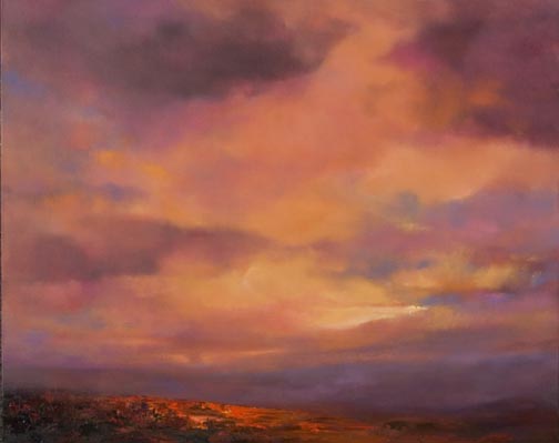
| Hidden in the Mountains Fran Larsen |
Fran departs from realism in other ways. In her painting entitled “Hidden in the Mountains,” she makes no attempt to portray a three-dimensional depth of field. “This painting is about a landscape, but my interest here is design and the use of flat space – a more cubist approach,” she says. Fran explains that she contrasts light and dark areas, using hues that vary in intensity, to give the painting a “feeling of push and pull.” She uses small dots to enliven the shapes and add texture.
There is another unique element in Fran’s paintings – the frames themselves. She designs, constructs and paints each frame to complement the painting. “The frame reasserts that the painting is an object, as opposed to a representation,” she says.
 |
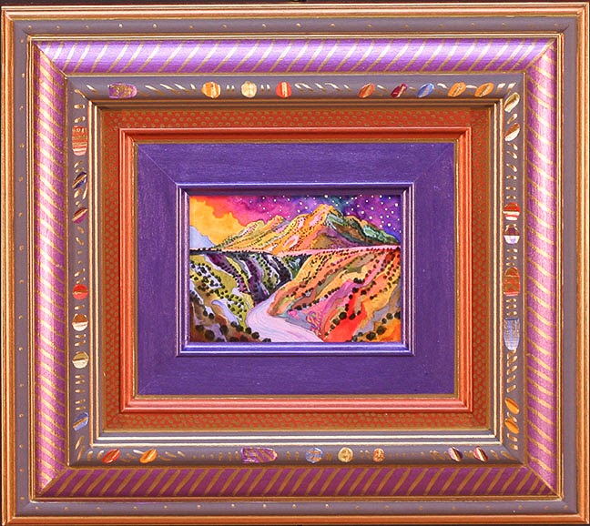
| Sunlit Canyon Sushe Felix |
 |
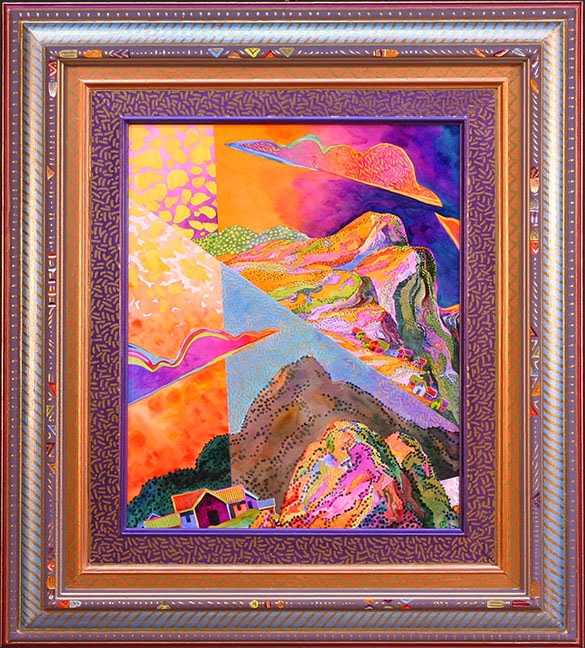
| Late Night Reflection Sushe Felix |
Thomas Hart Benton, who was at the forefront of the Regionalist movement, also influenced Sushe, as did the southwest regionalist painters, who took the local landscape and abstracted it. Sushe does that in her own way, with a strong focus on forms, shapes and color. You can see her unique style in two of her paintings, entitled “Sunlit Canyon” and “Late Night Reflection.” She likes to define the shapes of the mountains and sky with sharp edges, but contrasts that with soft shapes inside the borders. When I asked her how she created the delicate areas of clouds, mountains and trees, she said that she uses old brushes to scrub acrylic paint on her canvas to create a pastel-like effect. “I studied pastel in college, so I know how to blend very well,” she says.
Sushe often includes depictions of wildlife in her paintings. Here, her love of animals lead her to create endearing “critters” with round eyes – as you can see in two beautiful paintings entitled “Nest of Blooms.” and “Full Brood.”
|
|


Many people want a point of reference when they look at a painting. But more importantly, a painting should reflect the artist’s vision – seen through his or her emotional lens.
View more art by Fran Larsen and Sushe Felix at Wilde Meyer Gallery.