It’s a Woman’s World (at least in art)

By Judy Feldman | www.wildemeyer.com

Portrait of Adele Bloch-Bauer I , by Gustav Klimt
photo source: Wikipedia
Recently, I saw the movie, “The Woman in Gold,” about the painting of Adele Bloch-Bauer by Gustav Klimt. I’m sure most of you know the story behind this amazing painting. If not, see the movie or read the book!

In brief, this glorious painting, was finally returned to Adele Bloch-Bauer’s niece after it had been stolen by the Nazis and kept in Austria. She then sold it to Ronald Lauder for $135 million. It now hangs in the Neue Gallery in New York, where everyone can enjoy it.

Although Klimt knew his subject well, he chose to portray her in his symbolist style. Her beautiful face is dreamy and arresting, but the rest of the painting is an amazing design, rendered exquisitely in oil paint and gold leaf, with many patterns in her dress and on the wall behind her.

I started thinking about how the female figure has always inspired artists, since the very beginning of visual art. While we can appreciate the classical depictions of women, it’s interesting to see how artists have interpreted this subject differently.

In Your Dreams
Jacqueline Rochester
Looking though the works of Wilde Meyer artists, I see that there are just a few who paint the female figure. (Many prefer dogs, horses or cows!) Jacqueline Rochester, one of the gallery’s older artists, is deceased, but several of her paintings are still handled by Wilde Meyer. I’m particularly drawn to them because I see the influence of Matisse, and, like me, she portrays inviting places where you’d like to be. The figure is important, but it’s not the only interesting part of her work.

In her biography, she said, “My paintings are a word of youth, a secret world of leisure and play, of lovely places…It’s a world apart from today’s realism and society’s struggles.” Her painting entitled “In Your Dreams” is a good example. The well-dressed figure is looking out pensively, and behind her are the elements of a cozy home: colorful rugs, part of a chair, dogs and a rocking horse. Although these elements are not arranged in a traditional way, we can understand the story. The open composition style and the way she shows only part of most objects makes the painting more interesting to me.

White Orchids
Jacqueline Rochester

“White Orchids” is another painting that reminds me so much of Matisse because of its flat perspective and the simple rendering of the two women with just solid shapes and no worries about shading or small details. It’s another inviting scene, with many allusions to women: a domestic setting, and the feminine touch of flowers in the bowl, on a pillow, in a woman’s arms and on the wall (a painting which reminds me of Georgia O’Keefe -- a feminist!).

The Good in Everything
Andrea Peterson


Andrea Peterson, a young artist at the gallery, sees painting the female figure as a way of expressing herself. She says that the imagery she presents is an extension of her dreams. “The Good in Everything” is indeed a woman’s story. Andrea explained that the coy fish represent luck and prosperity; the white flowers are purity and goodness. Her loose painting style in this work help to convey the sense of floating through a dream.

Andrea’s women are portrayed in many different ways. The figure in “The Rider” is completely different; she looks determined and commanding as she leads her horse. Her dress is modern, even a little sexy for a horse rider (maybe her pants are in the barn). Then, in another style, Andrea invokes her inner Degas in the painting entitled “Corps de Ballet.”   She said, “In this painting, I was working with composition, focusing on the body poses. I liked showing the back view of the dancers, making them anonymous, and thus asking the viewer to think about their expressions.” The beautiful pastel hues and Andrea’s painterly brushwork for the background give the work great energy. The dancers look as if they just finishing twirling!
Corps de Ballet
Andrea Peterson
The Rider
  Andrea Peterson
The women in Linda Carter Holman’s paintings are stylized, with curvy shapes and glowing, innocent faces. Like Jacqueline Rochester, they are part of a story, a quiet life in the Southwest. Her use of bold color and small details on the objects that complete each painting make her work very appealing. The artist takes a simple act or seemingly mundane task, and makes it interesting. Linda has design elements that are symbolic to her and make their way into many of her works. The Calla lilies in the woman’s arm and the goldfish on the pot in “Little Winds” are an example of recurring themes. The woman in the foreground is touching the soil, but seems to be ready to take off and join her two friends as they fly away.

Little Winds
Linda Carter Holman
 
In “Loving Cup,” a bride offers a cup that has attracted two colorful birds. Her white gown and headdress seem to be carrying her aloft. She almost looks swan-like to me. You can see the goldfish again on the drink sticks in the foreground and on the vase in the background holding the calla lilies. There are other things going on in this painting: one woman shoots an arrow into the sky, while another looks on. There are shooting stars in the sky. These women are telling us a story about an event, something that triggered Linda’s creative mind.

Loving Cup
Linda Carter Holman
 
The female figure is often a thought-provoking focal point in a painting. Not too many are as dramatic as Klimt’s portrait of Adele Bloch-Bauer. I plan to have a good look at this famous work, when I visit the Neue Gallery in New York next week!

You can see more art by Jacqueline Rochester, Linda Carter Holman and Andrea Peterson at Wilde Meyer Gallery.

Artists as Storytellers

By Judy Feldman | www.wildemeyer.com

What stimulates the artistic mind to pick up a brush and create a painting, or to produce a beautiful object, or, for that matter, to write a compelling novel? Sometimes we see something that triggers our imagination – whether it’s a beautiful landscape, a bowl of perfect fruit, colors that turn us on, or a story that we’ve overheard.

Airing Out
Ka Fisher
Some artists use many of these stimuli to create their work. Painters can tell the story of what they’ve been thinking about through narrative art. These storytellers don’t use words; they use images and color to inform the viewer.

Ka Fisher’s paintings, which have a lovely, Impressionist style, tell stories about Native Americans – their land and the things they do during their daily lives. She told me that she often visits places like Chinle, Kayenta and Canyon de Chelly for her inspiration. At the Hubbell Trading post, she has taken a “listening tour,” where she overhears conversations among customers.

“I get many ideas from the people I meet as well as places I visit,” Ka said. “In the Town of Tubac, they have open wood structures that are used for events to give shade. They also have the same type of structures on the Navajo reservation.” Ka took this vision and developed a story in her large painting entitled “Airing Out,” where rugs are hung to air, and horses walk between them. “I wanted the narrative to be happy and fun, so I added many animals in the foreground,” she said.

Dreamboat Annie Cruisin'
Ka Fisher
Another painting, “Dreamboat Annie Cruisin’,” combines stories that relate to the Navajo way of life and Ka’s own history. “Here, I’m mixing memory and imagery,” she said. “The vintage cars are embedded in my mind from childhood.” Ka sets the scene in the mountain foothills, where Navajo display their rugs in and among a vintage car show. That may not actually have happened, but it’s Ka’s story to tell! The bright colors of the rugs and the cars create a lively, appealing scene.

Sometimes memories can play a role in narrative painting. In Ka Fisher’s case, she spent her childhood summers in Canada by a river near two Indian villages. The scenes she paints incorporate some of that landscape, along with the Southwest she has adopted as her current home.
My Market
Linda Carter Holman
Over in California, artist Linda Carter Holman tells painted stories about her vision of life. Many of the elements in her paintings have special meanings for her. In her painting entitled “My Market,” she created a scene that’s “how it would be if I had a market.” She said that the sunflower over one woman’s head is symbolic of the sun, which she couldn’t show because of the awning overhead. The lovebird in the cage is another favorite image, as is the goldfish in the bowl under the table on the right side. “Goldfish represent the miracle of discovering the world to me,” she said. Above the goldfish bowl, there is a jug with a small ladder leaning against it. Linda said that image also tells a story of self-discovery.

Lotus
Linda Carter Holman
Even though Linda uses a strong color palette, her painting is serene. The four women in the painting seem to be enjoying themselves as they walk through the market. They are soft-bodied figures, since Linda thinks that curves are more relaxing. You see curved shapes throughout the painting, which is filled in every spot with an image, because, as she says “every inch of our lives is filled with something.”

Her painting entitled “Lotus” tells a different story. It seems more mysterious to me. The solitary figure has her back to the viewer, so we don’t really know what she’s thinking. When I commented to Linda that things didn’t seem to be in scale, she replied that she was just creating a composition – a visual story – which unfolded in that way. “I just painted a moment in this woman’s life.” I asked about the umbrellas, and she said that they symbolize being prepared (that’s more necessary in Northern California than here in Arizona). She chose the image of the lotus because “it comes from the mud and becomes something, just as a person evolves.”


Treats
Judy Feldman
After speaking with these two artists, I started thinking about my own paintings. Do I tell a story, too? I actually think I do, since many of my paintings are about places I’d like to be – cozy settings, with colorful furniture, and, usually, a contented dog. “Treats” is a good example of a typical story I tell. The open book, the slippers and the tea and cupcakes all indicate that a person will soon be coming back into the room. The dog shares its owner’s good life, with treats for him on the table.

Cote D'Azur
Judy Feldman
Another painting, “Afternoon at the Cote D’Azur,” is inspired by a visit to the South of France. Here, again, my story is of an inviting place, with a table set for a possible romantic dinner, observed by the family’s dog and cat.

We all have stories. Some of us are fortunate to be able to tell them visually. But, even if you can’t paint or write, it’s important to share your stories with others. And, don’t forget to embellish them a little!


You can see more art by Judy Feldman, Linda Carter Holman and Ka Fisher at Wilde Meyer Gallery.

The Painter’s Emotional Lens

By Judy Feldman | www.wildemeyer.com

We often think of landscape paintings as representational art. But, in fact, many artists are so inspired by the landscape they are experiencing, they prefer to convey these scenes through the lens of their emotions.

I recently attended a lecture by a docent from the Phoenix Art Museum about the Hudson River School. These American painters of the 19th century hiked in uncharted territory of upstate New York, in awe of the wilderness around them. They sketched and wrote their memories on site; then created paintings in their studios that we would call realistic, but which conveyed their fascination with and love of nature.

Dawn Mountain Glow
Fran Larsen
Today, some contemporary painters express their reactions to a landscape in a different way. They choose to ignore local color and instead, use hues that convey their emotions rather than describe what they see. Others prefer to express themselves with more stylized, abstract versions of physical realities. To explore these different concepts of landscape painting, I called two artists from Wilde Meyer whose work I admire.

When she moved to Santa Fe, Fran Larsen was thrilled by the wonderful light there, the amazing landscape and the interesting cultures of its residents. Fran says that her paintings are metaphors of her reaction to these unique New Mexican characteristics.

“I’m inspired by the way the environment here makes me feel,” she says. “Because of the intense light, I see color in entirely different ways. Once color becomes arbitrary – rather than local – shapes can be arbitrary as well.”

Hidden in the Mountains
Fran Larsen
Inspiration for her painting entitled “Dawn Mountain Glow” came as Fran was looking out her window at the canyon below her house. She painted the arroyo that runs through the canyon – a technique she often employs. “Roads and rivers are entry points that take us into things, and I believe that each painting is an exploration for me and the viewer,” she says. As you can see, Fran’s choice of colors is personal, and doesn’t reference the local scene. I sense that her emotional lens was a joyful one – the vivid colors in the canyon and the sky make the painting energetic and pleasing.

Fran departs from realism in other ways. In her painting entitled “Hidden in the Mountains,” she makes no attempt to portray a three-dimensional depth of field. “This painting is about a landscape, but my interest here is design and the use of flat space – a more cubist approach,” she says. Fran explains that she contrasts light and dark areas, using hues that vary in intensity, to give the painting a “feeling of push and pull.” She uses small dots to enliven the shapes and add texture.

There is another unique element in Fran’s paintings – the frames themselves. She designs, constructs and paints each frame to complement the painting. “The frame reasserts that the painting is an object, as opposed to a representation,” she says.


Sunlit Canyon
Sushe Felix
Sushe Felix lives in Colorado. Her southwest landscapes have a distinctive style, which she claims is derived from her interest in American abstract painters from the 1930’s and 40s, as well as the modernist movement. “In particular, I’ve been influenced by Raymond Jonson, who led the Transcendental Painting Group in Santa Fe,” Sushe explained.

Late Night Reflection
Sushe Felix
I looked up the group on Google, and found that the aim of the Transcendental Painting Group was "to defend, validate and promote abstract art. They sought to carry painting beyond the appearance of the physical world, through new expressions of space, color, light and design."

Thomas Hart Benton, who was at the forefront of the Regionalist movement, also influenced Sushe, as did the southwest regionalist painters, who took the local landscape and abstracted it. Sushe does that in her own way, with a strong focus on forms, shapes and color. You can see her unique style in two of her paintings, entitled “Sunlit Canyon” and “Late Night Reflection.” She likes to define the shapes of the mountains and sky with sharp edges, but contrasts that with soft shapes inside the borders. When I asked her how she created the delicate areas of clouds, mountains and trees, she said that she uses old brushes to scrub acrylic paint on her canvas to create a pastel-like effect. “I studied pastel in college, so I know how to blend very well,” she says.

Sushe often includes depictions of wildlife in her paintings. Here, her love of animals lead her to create endearing “critters” with round eyes – as you can see in two beautiful paintings entitled “Nest of Blooms.” and “Full Brood.”


Full Brood
Sushe Felix
Nest of Blooms
Sushe Felix


Many people want a point of reference when they look at a painting. But more importantly, a painting should reflect the artist’s vision – seen through his or her emotional lens.

View more art by Fran Larsen and Sushe Felix at Wilde Meyer Gallery.


The Power of Simplification

by Judy Feldman | www.wildemeyer.com

Last month, I had the pleasure of visiting the Museum of Modern Art in New York to see an exhibit of Matisse’s cut-outs, a collection of the work he created in the final decade of his life. When he was forced to give up painting in his later years, Matisse began to work with painted paper and scissors, arranging the shapes into lively compositions, creating what he called gouache cut-outs.

Henri Matisse, "The Snail," 1953  source
Matisse called his new method drawing in color.  He stated, “For me it is a question of simplification. Instead of drawing the outline and establishing color within it, I draw directly in the color…this simplification guarantees precision as I reconcile two means now become one.”

Matisse’s cut-outs actually introduced a new medium in art: his compositions of colored paper were not like other artists’ collages of various materials. They were an intentional method of creating art. He also used his cut-outs as a way to create a composition, moving them around until he achieved what he wanted. Matisse was always thinking about relationships, harmonies and contrasts. Jodi Hauptman, senior curator for MOMA, called his cut-outs “a carefully orchestrated riot of colors.”

For me, the outstanding impression of this amazing exhibit was how Matisse simplified his shapes and used them to celebrate his love of form and color. For this blog, I started thinking about some artists at Wilde Meyer who use simplified shapes and strong hues in their visual language.

Shadowland, 48 x 48 inches
Jaime Ellsworth
Blaze, 48 x 48 inches
Jaime Ellsworth
Jaime Ellsworth uses a limited palette and images distilled down to their basic shapes to create contemporary depictions of animals she loves. I really like the power of “Shadowland,” where the partial image of the horses and their shadows connect in interesting geometric patterns. Here, simplicity is conveyed in such an elegant way. Jaime continues this theme in “Blaze,” again using partial shapes and limited colors. In this painting, both the positive and the negative space are of interest.

Dog Days II, 24 x 48 inches
Jaime Ellsworth
Things get more colorful in “Dog Days II.” But shapes are still very simple, and Jaime has painted the scene at the dogs’ eye level, which makes it so much more fun and appealing.

Trevor Mikula uses a palette knife to create his amusing paintings. He keeps things simple, too, with large blocks of color and a focus on one particular image. In “Like Your Hair,” he’s distilled the plant down to its basics: some curvy leaves and a red pot. That’s probably because Trevor sees things in his own humorous way! He also likes to transform mundane objects into a work of art – such as the old phone in “Ringer.” Here, the powerful hues and beautiful shapes of the background provide the art platform for the old black telephone.

Like Your Hair, 24 x 24 inches
Trevor Mikula
Ringer, 24 x 24 inches
Trevor Mikula
In Robert Burt’s paintings, strong color compositions portray the landscapes and architecture around him. Like Matisse, Robert distills his scenes down to their most elemental and powerful components, giving his paintings a very contemporary, stylized look. In “Colorful Morning,” he uses basic shapes to convey the mountains, trees, a house and a winding road with 3 cars – a seemingly simple endeavor that took considerable skill – especially his choice of colors that burst with energy to convey bright sunrise.

Colorful Morning, 30 x 30 inches
Robert Burt
We see this technique again in “Autumn.” Here, the fire red of the tree and its oversize shape get our immediate attention, but the muted trees in the background and the negative shapes of the sky, and the foreground with its shadow are still worth inspection.
Autumn, 44" x 44" inches
Robert Burt
Maybe this is kind of obvious, but I think that in this world of over-stimulation, it’s nice to look at art that celebrates simplicity! It’s such a powerful form of expression.

PS. Here’s a quote by the musician Frederic Chopin that recently appeared in a blog I read: "Simplicity is the final achievement. After one has played a vast quantity of notes and more notes, it is simplicity that emerges as the crowning reward of art."

View more art by Jaime Ellsworth, Robert Burt and Trevor Mikula at Wilde Meyer Gallery.

The Gift of Art

By Judy Feldman | www.wildemeyer.com

Holiday time inevitably becomes very stressful, especially when we have to select the perfect gift for a friend or family member. The stores are loaded with merchandise. It’s overwhelming! Here’s a better solution: give the gift of art. A small painting, a ceramic or glass object – any original work of art is certain to please. And, it’s the gift that keeps on giving, as they say, because the recipient can enjoy it for a long time.

Sadie in the Red Room
16 x 12 inches
by Judy Feldman
At this time of year, Wilde Meyer Gallery asks its artists to produce small works that would be appropriate for gifts. At first, that was pretty intimidating to me, since I didn’t have experience painting in a small format. But once I started, it was so much fun! By keeping the subject simple, you can work quickly, so the piece is very fresh and energetic. Small works are more intimate, too, so they have a certain charm that larger formats can’t provide.

The Blue Vase
16 x 12 inches
by Judy Feldman
The painting I just finished, entitled “Sadie in the Red Room,” was a great way to explore all the different shades of red, and since I worked quickly, I used the wet-on-wet technique, which gives a painting a nice, soft look. Red also played a role in another painting called “The Blue Vase,” since I used a layer of this color before I started painting the image. That technique gives the painting a nice, warm glow.

One of the great things about purchasing a small work of art is the chance to give (or acquire for yourself!) a piece from a favorite artist that you may not have been able to afford in a larger size. The Wilde Meyer artists that I’ve spoken to enjoy creating these small works – sometimes they work as studies for larger pieces later on. And, if your budget is larger, you can purchase several small paintings and offer them as a group arrangement.


You might be a bit overwhelmed when you see the wall of small paintings in the holiday show at the gallery. But, it’s worth taking the time to look carefully, and ask Laura, Andrea, Ryan or Jonathan to show the ones you like by themselves. The gift of art is a unique and memorable one!


The Tricks of the Trade

By Judy Feldman | www.wildemeyer.com

Whenever I admire a piece of art, I can’t help but wonder how it was done. How did the artist get that amazing texture? What colors did she or he mix? What type of brush or implement was used? In other words, how did they do that??

I looked at the works of some of the Wilde Meyer artists, and decided to ask them about their artistic process. I wasn’t sure if they would appreciate my questions, or want to divulge their “secrets,” but they did! (I think artists really love to talk about their work.)

Yellow Sun Vinyard, 28 x 30 inches, oil on canvas
Rena Vadewater
Rena Vandewater’s charming paintings are full of color and energy. She combines several techniques: pointillism, patterning and what she calls “scruffling,” which is her way of moving her brush very quickly on the canvas while mixing color. All three combine to create vibrant scenes.

Rena says that she sketches out a plan on paper and then on her canvas. To emphasize an area, she uses a warm color to draw an outline; then she paints inside that shape. “My patterns come from my head,” she says. “They go together like a puzzle. When I don’t know where to go next, I stop for a few days, and wait until I feel inspired to go back to the painting.”

Dingo Dogs, 19 x 23 inches, oil on canvas
Rena Vandewater
Travels often inspire her paintings. “Yellow Sun” is a scene from vineyards Rena saw while visiting France. “I want the viewer to see a real reference, yet enjoy the wonder of the painting,” she says. The red ground behind the vineyard patterns, as well as the red outline of the small buildings and the sun give this painting so much energy! The shapes remind me of quilting.

Rena has worked hard to create and maintain her unique style. Initially, she was self-taught; then she went on and obtained an MFA degree. “Although I’ve studied and learned classical painting, I prefer the naïve, primitive style,” she says. “Dingo Dogs” is a good example of Rena’s unique take on a landscape. Here, she employs all of her special techniques: the red outlines, the scruffling for the trees, the patterns in the houses, the flat paint for the dogs, and the wonderful pointillist dots for the land. Her use of the complementary green and red in the dots really makes the painting pop. To top things off, Rena encloses the painting in a patterned frame. It’s busy, but it works!

Desert Garden by Acacia Alder
40 x 30 inches, acrylic on canvas
Acacia Alder loves to hike in the trails around her Tuscon home. She’s inspired by the landscapes she sees, and wants to depict the dynamic energy that exists there. Acacia conveys all this through a technique she employs to give her paintings a sculptural, three dimensional look. I asked her to explain.

“First, I use acrylic gel to sculpt the surface in very particular areas,” she says. “That creates a form for the subject matter, which is somewhat abstracted. Then, I paint over the gel. Each painting has many layers of both gel and paint. It can take quite a while to complete.”

Elan: Palo Verde Musings by Acacia Alder
36 x 36 inches, acrylic on canvas
Acacia uses many different implements, including palette knives, brushes, small spatulas and even hair combs for texture. She says that her technique enables her to impart tonal changes, because the gel textures can more easily highlight the light and the shadows. You can see the sculptural quality of the beautiful tree in her painting entitled “Elan: Palo Verde Musings.” Her excellent use of light and shadow, along with a dark outline, makes the tree emerge from the abstract shapes of the landscape behind it.

“Desert Garden” is one of my favorite paintings by Acacia. The many textural shapes and wonderful color palette create energy, and the smooth, burnt orange path is a great, restful contrast. I really like the foliage shadows she’s created on the path.

Tracy Miller has a very interesting creative process. “I have a specific set of rules for myself when I paint,” she says. “I tone every canvas with a wash of either yellow, orange, red or hot pink to give a warm glow that informs the painting.”

Tracy explains her next step: “I make a visual haiku with black paint to create a balanced design of lines, circles or disjointed forms.”

Roughneck by Tracy Miller
11x 14 inches, acrylic on canvas
Bear by Tracy Miller
5 x 7 inches, acrylic on paper
Then, Tracy paints an abstract design within the black lines, while she finds a shape to help guide her to her final image. “It’s like looking at clouds and seeing distinct shapes,” she says. Certain shapes evoke certain animals to her. She sees bears in circular shapes; cows in more boxy shapes and buffalo in sharp angles. Tracy’s fine art background and familiarity with animals enables her to depict their structure and muscles even in her unconventional style. She purposely doesn’t show the entire animal, since she wants the viewers to finish the picture in their heads. When you look at two of her paintings, entitled “Roughneck” and “Bear,” you can get an idea of how she works.

Blue Mood by Tracy Miller
20 x 10 inches, acrylic on canvas 
After the abstract painting is complete, Tracy draws a simple outline in pencil of the final image she wants. Then she paints the negative space around that shape, which becomes the background. Amazing! When you look at “Blue Mood,” keep in mind how the image of the giraffe emerged. As a final touch, Tracy creates her unique signature of paint splatters across the canvas. “I do this to give additional energy to the painting,” she says. “I’m very mindful of the color I use, and after I’ve splattered, I know the work is done!”

Each of these artists has refined her process over time, and is now completely comfortable with it. What’s interesting to me is how personal these approaches are, and that’s why their work is so unique. Even if we understand the process, we can never paint the same way. Who wants to, anyway?

View more art by Rena VandewaterAcacia Alder  and Tracy Miller at Wilde Meyer Gallery. 

What’s Your Visual Language?

By Judy Feldman | www.wildemeyer.com

Every artist has his or her visual language – sometimes it’s figurative, sometimes it’s not. I must confess, I’ve been avoiding this blog topic for quite a while. You see, I enjoy looking at most abstract art, but as a figurative painter, I find it hard to comprehend how it’s done.

One way to find out is to talk to some abstract artists! I made some calls, and our conversations were quite interesting. My take-away from talking to these three people is that abstract art is fun to make…but it still intimidates me!

Zuni Pueblo by Jack Roberts, acrylic on canvas 50 x 70 inches

Jack Roberts is an accomplished, mature artist who has been creating abstract paintings for quite some time. He strives to create a visual sensation, rather than a pictorial reference. “Abstract art is not derivative of representational painting,” he said. “It’s something all itself.

“When I paint, it’s more about the paint and the composition. I like pushing color and shape buttons to stir the viewer’s visual emotions,” he explained.

Honaki by Jack Roberts,
acrylic on canvas 50 x 70 inches
I’m a person who thrives on color, so I’m very drawn to Jack’s paintings. As you can see in his painting entitled “Zuni Pueblo,” his colors are very clear; he mixes beautiful opaques with jewel-toned transparent hues.

Jack works on a large canvas, on a flat surface. He says he likes to paint wet-on-wet, so the paint is always moving. He uses many different implements, from plastic spatulas to push brooms and house paint brushes. A garden hose is used to remove paint in some areas, and reveal other dry paint underneath, to create the layers he wants.

Sandia Peak I by Jack Roberts
acrylic on canvas, 50 x 50 inches
“I like to work freely and go where the paint takes me,” he said. “But, although I want my work to look spontaneous, each painting requires considerable thought, to make sure I achieve the proper composition and color relationships.”

Although Jack’s paintings are not referential, he does admit to being inspired by the many places he visits, from tropical islands to the landscapes of New Mexico and his hometown of Sedona. He also thinks back to personal experiences, and his perceptions of them, rather than the actual events. “Honanki” and “Sandia Peak 1” both speak to me of the Southwest.


Ryan Hale said his influences are the large color-field abstracts of Barnett Newman and Mark Rothko. But his unique body of work reflects his interest in how man-made materials and natural forms interact with each other. Some of his abstract paintings refer to aerial views of cities where these two elements co-exist. Sometimes, they work well together; and, as we know, at other times they clash. His painting entitled “Through the City” presents us with this conundrum.

Through the City by Ryan Hale,
acrylic on canvas 60 x 48 inches 
Forces of Nature by Ryan Hale
acrylic on canvas 60 x 48 inches 

After speaking with Ryan, I believe his artistic process is an introspective one. He can see a space where layers of old posters have been torn off and just remnants remain, take that mental reference and use it for a painting. He explains that “the textures and surfaces of a city wall after years of weather, repainting and painting over graffiti or various forms of damage, all stacked and layered through the filter of time, can be quite beautiful.”

The Forming Earth by Ryan Hale
acrylic on canvas, 36 x 36 inches
As for his techniques, Ryan uses acrylics and select glazes to produce translucent and opaque color layering. One of the reasons I like his work so much is his signature color: red! “The Forming Earth” is a good example of his skill with hues and his beautiful red.

Ryan said he works on several pieces at once. He’ll have general ideas for a painting, but they often change, especially since he works very fast, to convey movement and energy.  I think you can feel this energy in “The Forces of Nature.” Then, he’ll stop and think about the piece for a while before he changes or adds things. He said that he generally starts with darker hues, and then builds up to lighter ones, looking to see how the colors are flowing and working with each other.


Here and There by Ava Young,
mixed media on canvas, 40 x 30 inches
Ava Young is a mixed media artist who enjoys selecting different materials to layer and create paintings with interesting textures. “You have to be willing to be a mad scientist,” she said. And, referring to her passion for non-figurative art, she added, “Abstract painting allows me to invite viewers to venture away from their intellect and respond with the heart.”

Ava brings her interest in collage to her paintings. She works intuitively; starting with a base of molding paste mixed with such materials as dry wall powder or sand to create a ground of texture. Then, she adds other materials. “Here and There” was made with paper, sand, glass beads and metal wire. She paints first with acrylics, and adds a layer of oil paint to give a translucent finish.

Dancing Away by Ava Young
mixed media on canvas, 30 x 40 inches
The open-ended process of abstract painting appeals to Ava. She adds and removes layers of paint (with alcohol or a magic eraser) to create a new set of textures and colors. “I just keep going until it seems right,” she says. “And, sometimes, I go back to a painting later and make more adjustments.” Her painting entitled “Dancing Away” required many hours of applications and removals.


Spontaneity, energy, emotions and a lack of boundaries seem to be at the heart of abstract painting. I think that’s why so many artists are drawn to this style of visual language.
Could I? Stay tuned!

View more art by Jack Roberts, Ryan Hale and Ava Young at Wilde Meyer Gallery.

Just Say “No” to Canvas!

By Judy Feldman | www.wildemeyer.com

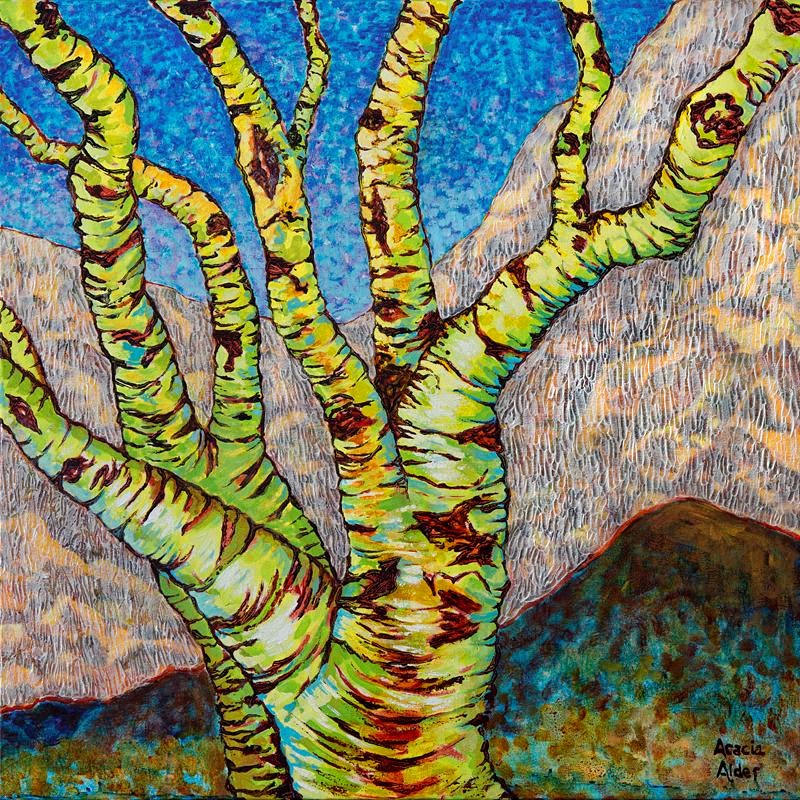
Since I’m a fairly traditional artist, I paint on canvas or, sometimes, wood panel. But, I’ve discovered, after talking to other artists at the gallery, that it can be fun to paint on other surfaces.

That’s not such a new idea. Aside from really early paintings such as petroglyphs, traditional art was made on wood panels, before canvas came into use in the early 1400s. According to Wikipedia, panel painting remained more common until the 16th century in Italy and the 17th century in Northern Europe.

But, walls and wood panels are pretty ordinary surfaces. How about vintage windows; mixed media with glass and paint; sheet metal and ceramics? That’s what I saw looking at the Wilde Meyer website, so I decided to give those artists a call.

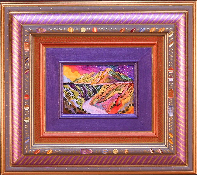
Melinda Curtin is done with canvas. She’s entranced with glass art. “Ever since I started painting on glass, I didn’t want to paint on anything else,” she said. Her favorite surface is old glass windows, which she finds at salvage yards. But, she says, “People hear about my work and bring me their old windows!”

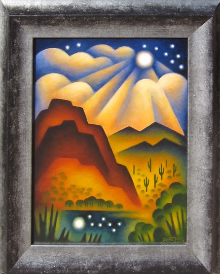
Melinda enjoys the process of painting on smooth glass. She uses acrylic paints, often layering to get the desired effect. However, painting on glass can be challenging. Melinda says that it’s a reverse process, so she has to paint all the details first, and then the large spaces afterwards. If you look at “Casa Blanca,” you can see that the house, cacti, mountains and clouds are all outlined in black, and the big shapes are mostly flat paint. Sometimes Melinda leaves a little space between the outline and bigger shape to let a little of the transparent glass show through. She’s also designed a frame of gold leaf on the glass, which fits inside the window pane.

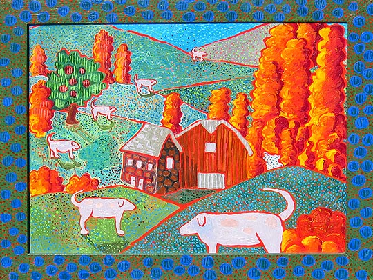
“El Parajo” also has its own painted border. This painting, too, has a folk art aspect to it. Melinda told me that in Europe, painting on glass was generally folk art, so she also chooses themes in this tradition.

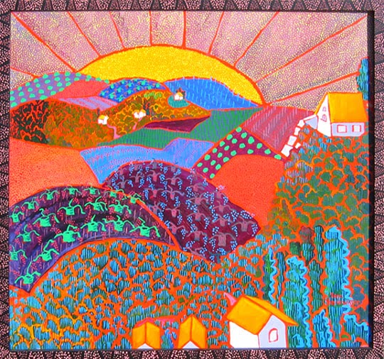
Aside from loving the process of painting on glass, Melinda says that this support medium gives her images a very luminous effect. And, the vintage windows are a great conversation piece: just look at “The Farm.” A great way to recycle!

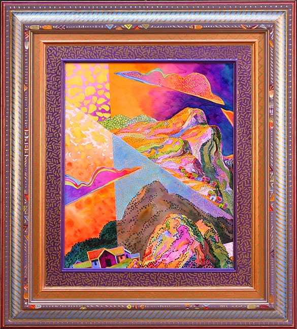
Josiane Childers enjoys painting on smooth surfaces, too. She’s chosen thin sheets of steel, as well as plexiglass to support her beautiful abstract paintings. She works with her husband Justin, who prepares the surfaces, grinding parts of the steel and plexiglass to create texture. He also creates the frames on which the steel pieces are attached.

When she paints on plexiglass, Josiane works on the frosted side, but presents the painting on the smooth side. She encounters the same challenges as Melinda, since she, too, is painting in reverse.

You can see the ground textures in Josiane’s dreamy landscape entitled “Captivate.” They take the paint pigment differently, and since they are darker, they appear to be behind the other images. She’s also created a beautiful reflection of the vertical tree shapes with softer strokes and tones. “I find it exciting to paint on other surfaces,” she said. “It makes my work look more diverse.”

Thin steel gives Josiane another option to present her art. The two pieces of her vertical diptych entitled “Invoke” are uniquely shaped and curved, welded to a flat frame. Again, the textures on the steel show through, offering spontaneous shapes, grabbing color in a different way than the smoother areas. Josiane paints intuitively, using bright colors, and these surfaces seem to work so well for her.

She hasn’t abandoned canvas, but when she does paint on that surface, she textures it as well, using molding paste and then, thick paint. “Materialize” is an example of her mixed media technique.

Nancy Pendleton and her sister, Sandy are both artists. Nancy is a painter and Sandy works in glass. Often, they combine their talents to create mixed media pieces on wood panel. Although that surface is traditional, their collaborative work is not. Nancy paints an abstract ground for Sandy’s glass centerpiece. “We’ve worked out a technique,” said Nancy. “I often use a centerpiece in my art, and Sandy came up with glass pieces that work well in my paintings. You can see examples of this sibling partnership in “What You See Is What It Is #2 and “Oasis.”

Kathryn Blackmun was a graphic designer and illustrator living in Los Angeles. When she moved to Santa Fe, she decided to study ceramics. Now, her whimsical images of dogs, cats, cowboys and cacti are painted on greenware plates.

Kathryn’s challenges are different from those of Melinda’s. She doesn’t paint in reverse, but since she works on gray-colored clay, she can’t see colors accurately when she creates her images with underglaze paint. “The greenware has to be fired for seven hours, and cooled for several hours before I can tell if the colors are what I wanted,” she said. “It’s definitely unpredictable!”

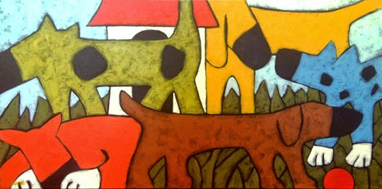
This labor-intensive process ends with a coat of clear glaze, and another firing and cooling. To look at a happy piece such as “Dog Trek,” you’ve never know it was so time-consuming! “Cowboy Palomino” is a good example of Kathryn’s folk art style, which is well-suited to this type of ceramics.

After I finished interviewing these artists, I went to a local thrift shop. Poking around, I found three wood frames with glass inserts. Guess what I’m going to try? But, I’m not abandoning canvas. I have too much inventory!