High and Low


The Dramatic Effect of the Horizon Line (and what happens when it’s not there…)

Claude Monet "Water Lilies" (Source: Wiki Commons)

During a visit to Paris last September, I spent several hours at the Orangerie museum. That’s where Monet’s amazing water lilies mural paintings are displayed. There are four walls of murals, which were painted on canvas and then affixed to curved walls. Each mural is 41 feet long and more than six feet tall. The visitor is invited to sit and contemplate these tranquil images, designed to “offer an asylum of peaceful meditation at the center of a flowery aquarium.”

What I noticed is that these paintings seem to pull the viewer in, to embrace you in such a way that you feel as if you are right on top of the pond, and almost inside it. I wondered whether the lack of a horizon contributed to this sense of no spatial limitations.
Some of the artists here at Wilde Meyer have created that sense of being pulled into their painting by omitting a horizon, or by placing it in a particular way.


Robert Charon’s “Koi Pond II” evokes the same feeling to me as Monet’s water lilies. I’m drawn into the pond, as he creates a wonderful illusion of depth, with the dark outlined stones at the bottom, the bubbles on the surface and the koi floating through them. This painting calls for reflection, too.

Koi Pond II mixed media on panel with resin varnish 24"x36"
by Robert Charon

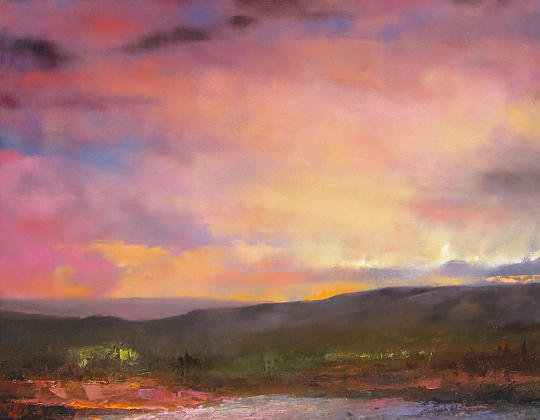
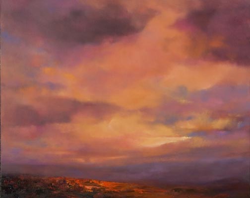
In some of his other work, Robert creates a different mood by changing his horizon line.

Sunset II acrylic on panel with resin varnish 12"x16"
by Robert Charon


“Since the horizon line gives the viewer a focal point, its placement depends on the subject matter,” he said. “In ‘Sunset II,’ the horizon is low, since I wanted the majority of the painting to be the sky. By showing the sunset as the lightest hue near the horizon line, and painting deeper hues above it, I can create the glow of the sunset.”

Through the Reeds acrylic on panel with resin varnish 12"x36"
by Robert Charon

Mini Distant Trees 6" x 6"
by Robert Charon
In his work entitled “Through the Reeds,” Robert actually has two horizon lines – the line where the reeds meet the water, and the small line where the reeds part, to reveal the trees behind them. The technique of this narrow 12”X36” painting is pretty amazing: my eye focuses first on the reflection of the reeds on the water, and then travels far in the distance. It’s a painting that holds my attention!


A small piece, called “Mini Distant Trees” also is interesting. The horizon line is almost in the middle, indicated by small trees. The pale sky takes your eye back, but the swath of red in the foreground is arresting. It’s a soothing painting, and yet, it’s not.

Robert Anderson, another Wilde Meyer artist, also changes his intentions, between abstract and landscape paintings. In his large work entitled “Floating in Time,” as well as “Clarity, Movement and Light,” Robert wants to “draw viewers into the painting, and keep them there.”

Floating in Time oil on canvas 96" x 72"
by Robert Anderson
Clarity, Movement, and Light oil on panel 24.5" x 24.5"
by Robert Anderson


When he’s doing landscapes, he favors a high horizon line, since he is interested in showing distance.
“With a high horizon, I can create a more dramatic vista,” he said. “The deep foreground gives me more space to show the relationship between the flowers and plants I’m focusing on, and the trees and mountains in the far distance.”
Summer Sunflowers oil on panel 33.5" x 31"
by Robert Anderson

You can see an example of Robert Anderson’s technique in “Summer Sunflowers.” The large flowers in the foreground seem even larger when contrasted with the receding background, with its much smaller flowers and trees. The intensity of the flowers’ hues also brings them forward to us, while the small line of sky seems to blend in with the soft shades of the background.


“Summer Blue,” a large 46”X66” painting, is another work with just a sliver of a horizon line at the very top of the painting. It’s quite faint, but it still helps to give the viewer the illusion of depth. Robert’s interest is obviously the field of flowers, but it wouldn’t be nearly as effective if he didn’t include the small trees and hills behind them and the little strip of pale blue sky.


Summer Blue oil on panel 46" x 66"
by Robert Anderson
A very low horizon line has the opposite effect. If you look back at the post I wrote on August 16th about Albert Scharf’s cloud paintings, you see how he uses the thin slice of land below the clouds as a counter balance which, he noted, makes the sky look even larger.

Landscape 618 oil on canvas 30"x40"
by Albert Scharf

So you see, the painterly intent of the artist is often tied into the placement of the horizon line and can really elicit certain emotional reactions to a work. What do you prefer?  Let us know in the comments.


Expressionist Landscape Painters:


The World Through Rose Colored Glasses


Question: What kind of world is it when you don’t see black, grey, and brown?
Answer: It’s the world of colorists and expressionist landscape painters.

Desert Oasis 24.5" x 30.5"
by Michelle Chrisman

And what a lovely world it is. I know that personally, I ‘m attracted to high color. The primaries are my friends, and I don’t want much to do with those “sad,” muted colors.

In my last post, I wrote about landscape as a personal vision. I noticed that there are some other landscape painters at Wilde Meyer who express how they feel when they look at a scene, rather than try to reproduce it. These painters feel really good!

Michelle Chrisman does the majority of her painting outdoors in New Mexico. “Part of the enjoyment for me is to be outside, to paint quickly and record my emotional response to what I’m seeing,” she said. “I love to get in the zone, surrounded by nature, and paint alla prima, that is, wet on wet, finishing in one session.” Her painting entitled “Desert Oasis,” shown at the top of this post, is a good example of her fresh style. It’s as if she took in her surroundings and expressed it in just a moment, to say how it affected her.

Michelle is a colorist who “hyper sees,” that is, she sees the hues that make up the local color others perceive. She’s very interested in the effect of light and spectral color, which is defined by Wikipedia as “a color that is evoked by a single wavelength of light in the visible spectrum, or by a relatively narrow band of wavelengths. The spectrum is often divided up into named colors: red, orange yellow, green, blue and violet.”

Kitchen Mesa 24.5" x 30.5"
by Michelle Chrisman


You can see Michelle’s technique and color vision in her painting entitled “Kitchen Mesa.” It was painted at Ghost Ranch, the site of many of Georgia O’Keeffe’s paintings. I like the wonderful reds and yellows she uses to show warmth and light, and the soft violets to indicate the shadow of the rock crevices. The blue/green hue in the foreground really pops against the red tones around it. In addition to strong color, Michelle uses heavy texture with a palette knife to describe her landscape.

“For me, paint is part of the experience,” she said. “I want it to be luscious, to say ‘I’m paint, touch me!’”

Barbara Gurwitz wants to create a sense of place in her landscape paintings. She takes photos and does sketches of the special places she wants to paint. But realism takes a back seat to the expression of how she felt at the time of her visit to the site. “I’m not interested in duplicating the colors of nature,” she said. “I’ve always chosen colors that speak to the way I see the world, which are sometimes different from what you would expect.”

View from the West 24" x 30"
by Barbara Gurwitz

High Country Summer 40" x 60"
by Barbara Gurwitz
When looking at one Barbara’s paintings, “A View from the West,” I know it’s a scene of a southwestern village in the foothills of a mountain range. But her strong, primary colors give this landscape great energy and a charming, folk art quality.

Santa Cruz Autumn 34" x 44"
by Barbara Gurwitz
Barbara also seems to see through rose-colored glasses, and that may be because she uses a red ground under her paintings. “It’s a wonderful neutral,” she said. She leaves the red as negative space in some areas. This is evident in most of her paintings, such as, “High Country Summer” and “Santa Cruz Autumn.” The red under-painting makes everything glow!

When Barbara paints, she often calls upon her spiritual mentor, Vincent Van Gogh (who wasn’t quite as upbeat as she). “I love his willingness to paint as he saw fit, and he’s always been an inspiration to me.”

 Leigh Gusterson learned to paint in New Jersey and was trained in the Hudson River style of plein air painting. “It was grey and humid a lot of the time, and my paintings reflected that weather.” But things changed when she relocated to Taos and experienced the effect of the light there. Now, Leigh loves to push color when she paints on location at her favorite sites.
Hollyhock Morning 9.25" x 12"
by Leigh Gusterson

“As artists, we train our eyes to see shapes, form and color more intensely,” Leigh said. “I like to share what I see with viewers of my artwork.” Even though Leigh uses non-traditional colors (as in “Hollyhock Morning”), she said that her palette is simple, with just 12-14 colors. “I can make anything I want with these colors,” she explains. “And, sometimes, it’s just the awesome New Mexican landscape that displays these amazing colors!” She said the pink cliffs in “Magpie Playground” really exist.


Magpie Playground 17.25" x 21.5"
by Leigh Gusterson

Like Barbara, Leigh enjoys painting scenes of villages nestled in the mountain foothills, with their farms, houses and church. She, too, chooses to wear rose-colored glasses, and infuses some of her work with a sense of whimsy, as in “Drive By Sheep.”

Drive By Sheep 27.5" x 27.5"
by Leigh Gusterson

So, if you’re living in the southwest, take a drive to a favorite spot and look again. You, too, may see some amazing colors you’ve never noticed there before.

Landscape: A Personal Vision


I just returned from a wonderful trip to Santa Fe. I was struck by the stark beauty of this area, and how much sky one sees there. At times, the sky takes over nearly the entire field of vision, and the ground is just a small sliver underneath. Just driving there on 1-40, I noticed how the very low horizon changed my perception. I felt surrounded by the large, billowy clouds. That’s an idea I’ll pursue in another post.


It’s easy to understand why so many artists who live in Santa Fe choose to paint landscapes. Albert Scharf and Fran Larsen exhibit their work at Wilde Meyer. Both interpret the landscape differently.

Landscape #616 oil on canvas 40"x30"
by Albert Scharf

Looking at Albert Scharf’s beautiful cloud paintings, you can really sense the vastness of the sky I was feeling myself. When I spoke with him, he said that he finds that clouds are an interesting subject because of what they do to the light, and since they have abstract shapes, he’s not bound by form or structure.

“Clouds have an amorphic shape that enable me to pursue my interest in the emotional content of color,” he said. “Also, the manipulation of their hard and soft edges gives great energy to the paintings.”

High Desert Mountains 30"x30"
oil on canvas by Albert Scharf
At first, Albert just painted clouds, but he then decided to add the thin slice of land below as a counter balance which, he noted, makes the sky look even larger. This is the effect of the low horizon that intrigues me. You can see how this happens in Albert’s painting entitled “Landscape 616.” (Yes, he numbers his paintings and has done nearly 800.) In “High Desert Mountains,” he has increased the size of the ground and given it texture with a palette knife, which gives the painting a completely different look.

Landscape 576 oil on canvas 48"x60"
by Albert Scharf
Although he has seen many beautiful Santa Fe skies in the 30 years he has lived there, Albert does not use local color; rather he prefers to present his ”skyscapes” in saturated hues that transcend through the conscious into the subconscious. “I want to take my viewers to a place where they feel good,” he said. A great example of his wonderful use of color can be seen in “Landscape #576.”


Companion Paintings 24"x96" (diptych)
by Albert Scharf
Lately, Albert has created several “companion paintings,” which involve two or more pieces that have similar landscapes, but one is in warm tones and the other cool. When hung together, they look like reflections of each other.


Although Fran Larsen has lived in Santa Fe for many years, she grew up in Michigan, where she spent time with her uncle, who was a glacial geologist. “We talked quite a bit about geology and the anthropology of the old tribes who lived in the areas we visited,” she said.

South from Beyond  28"x60"
by Fran Larsen

When she moved to New Mexico, she was thrilled by the wonderful light there, the amazing geologic forces that created the landscape and the interesting cultures of its residents. Fran says that her paintings are metaphors of her reaction to these unique New Mexican characteristics.

Dawn Passage 13.5"x13.5" by Fran Larsen
“I am inspired by the way the environment makes me feel,” she says. “Because of the intense light here, I see color in entirely different ways than I did in Michigan. Once color becomes arbitrary – rather than local – shapes can be arbitrary as well.” As you can see in “Dawn Passage,” Fran picks her own colors for the mountains, sky and houses, and creates a more stylized vision of the landscape.

Like Albert Scharf, Fran Larsen paints her personal experience, rather than an actual depiction of what she sees. She prefers to paint her reactions to a scene – “what it creates in me” – which helps her remove the “horse blinders that make us see things so literally.” Many of her paintings feature a road that winds through the mountains - - such as “Take the High Road” and “Deep in the Canyon.” Perhaps that symbolizes the journey that she has taken with her art in Santa Fe.

Take the High Road 24" x 28"
by Fran Larsen

Deep in the Canyon 22" x 26"
by Fran Larsen
 
There is another unique element in Fran’s paintings – the frames themselves. She designs, constructs and paints each frame to complement the painting. “The frame reasserts that the painting is an object as opposed to a representation,” she says.
 

Early Dawn, Arroyo and Mesa 38" x 22"
by Fran Larsen


It’s A Dog’s World,-At Least for This Month


Dog Days the 20th, August 2012
Coyote Underbrush by Sarah Webber
 We all know that dogs are man’s best friend, right? I think that you could also say that dogs are one of Wilde Meyer artist’s favorite subjects – especially right now, when the 20th annual “Dog Days of Summer” show is up at the Marshall Way gallery. As noted in the show invitation, the "dog days of summer" refers to the period of time between early July and early September when the Dog Star, Sirius, is visible in the night sky. Presumably because Sirius appeared during the very warm days in August, "dog days" came to signify the hot humid days of summer.
Party Dogs in the Pueblo by Melinda Curtin 

There are several great things about this show. First, it features small and affordable paintings. So, it’s a great way to collect a piece by a favorite artist without spending too much. Second, it showcases many different kinds of dogs in so many painterly ways.


Some artists choose to paint the dog in a more realistic manner, such as Sarah Webber who has done an impressionistic portrait of a coyote. Others, such as Melinda Curtin, favor a more non-traditional route. Her dancing dog is reverse-painted on glass in a contemporary, funky way.


Sounds Resonable by Linda Carter Holman


Top: Pancake and Polly, Puggie
Bottom: Whittle Brown Baby, Pug
by Trevor Mikula
If you follow the artists at Wilde Meyer, I’m sure you’ll recognize their style in these small dog paintings. Linda Carter Holman’s painting has so many of her favorite “accessories:” calla lilies, a pearl necklace on the dog, a bowl of fruit, lovebirds and a goldfish bowl. Trevor Mikula shows his wacky characters- some adorable hounds you’ll probably never see in real life! As usual, Connie Townsend’s dogs are going for a joy ride – this time on a motorcycle.

You’ll also recognize Sushi Felix’s distinctive style in the stylized canines she’s portrayed. You might even recognize my two pieces (hint: Plein Air Pooch and The Secret of the Missing Cupcake). The latter was inspired by a photo of a friend’s dog who was stealing a sweet potato. I thought a cupcake would be more appealing!


Biking the Bloomin' Desert by Connie Townsend

Coyote Pups and Little Coyote by Sushe Felix

Plein Air Pooch by Judy Feldman

The Secret of the Missing Cupcake by Judy Feldman

The last, and maybe best, great thing about the Dog Days of Summer show is that so many artists choose to participate (more than 30 this year). It’s so much fun to paint dogs in different ways, and we all enjoy the spontaneous pleasure of working on a small canvas. So, brave the heat of August, and cool off at the gallery while selecting your favorite hound. If you’re in Tucson, the show will be up there in September.

"Dog Days the 20th" view from outside


Found Objects II: Bill Colt, Step by Step

Maroon Sunset by Bill Colt
In my last blog, I talked about two artists who recycle materials to create unique art pieces. There’s another artist at Wilde Meyer who also is into recycling, using old newspapers and magazines as a background for his acrylic paintings. Bill Colt goes to antique stores and flea markets to find old magazines, comic books, engineering manuals and random reading material.


Tuskegee's Finest by Bill Colt
Bill’s a corporate pilot, and some of his paintings include pieces of aviation maps, old Pan Am ads and aviation engineering manuals. His collage technique is pretty methodical, as you can see from the interesting photos he was willing to share when he was creating his painting entitled “Estelle,” which Bill was commissioned to do for  Del Frisco's Grille, a new restaurant in Phoenix.

To start, he creates texture on his canvas with joint compound and bits of things like cheesecloth. 


Then, he collages pieces of his printed materials on the canvas with gel medium. In this photo, you can see the vintage ads he uses. I like the one for Duz soap – I think that was from the ‘50s. The blonde woman smoking the cigarette reminds me of Betty in “Madmen!”


As the creative process takes over, Bill draws his image in charcoal (I can still see the Duz ad and Betty.), and then paints with acrylics, covering agood portion of the collage work.


To finish, he glazes his painting with a product that deepens and enriches his colors. Here, Estelle is looking right at us in a very engaging way, and although there is really no correlation between the cow and the old ads, the images work very well together. The owners of Del Frisco liked this painting so much, they commissioned Bill to do another version for their restaurant in Washington, D.C.

Estelle by Bill Colt
48"x48"
The different papers give Bill Colt’s artwork an additional dimension and an element of graffiti. Like Charles Davison, Bill’s paintings can be enjoyed at a distance, and then examined up close to see what’s beneath the paint. That makes these paintings especially interesting to me.