By Judy Feldman |
www.wildemeyer.com
We often talk about an artist’s style – the way he or she paints that’s easily identifiable. That can apply to realism, abstraction and anything in between. There’s also stylized painting – a technique whereby the artist depicts an image in a unique way – presenting subject matter, forms and color choices that are very distinctive.
The Wilde Meyer artists I spoke to all said that they want to take the viewer beyond the subject by eliminating certain details and adding their own artistic marks.
 |
Loire Valley 35.5" x 35.5" oil on canvas
by Rena Vandewater |
 |
Pear Tree 19" x 25" oil on canvas
by Rena Vandewater |
For example,
Rena Vandewater, an artist from Idaho, paints scenes from places she has visited, and although some of the elements are identifiable, much of the paintings are about her artistry. As you can see in “Loire Valley,” the chateaux are there, but the orange hills and vibrant green trees are definitely Rena’s invention.
“I work very intuitively,” she explains. “The painting talks to me the whole time I’m working on it. The patterns and shapes evolve in the process, and although I see the image as a whole, each space has a life of its own.”
Rena discovered that the lines and dots of her patterned areas give the paintings a 3-D effect. “By using this technique and vibrant colors I can add movement to the painting.” This 3-D aspect is evident in “Pear Tree,” which also reflects her love of quilts and textiles.
 |
| Jaime Ellsworth and companions |
Sometimes, stylized painting removes details, focusing more on shapes and color. The work of artists
Jaime Ellsworth and
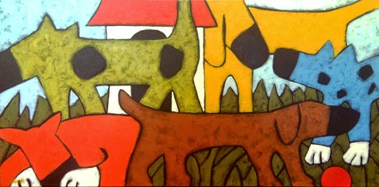
Robert Burt fall into this approach. Jaime calls herself a “shape artist” who likes to keep her art “on the lighter side.” She doesn’t work from photos – just “what comes out of my head” – but I think she’s inspired by her family of 4-legged pets, including dogs, a goat and miniature horses. As you can see in her painting entitled “Scent,” she knows just what dogs do when they get together! (Jaime probably gets a lot of laughs from her animals. I just can’t resist including this photo she sent me of a typical car ride for her.)
 |
Scent 24" x 36" acrylic on canvas
by Jaime Ellsworth |
“Waterbowl” is a great example of Jaime’s skill with shape and color. There are basically three shapes in this 30X40 painting – all the details are distilled away, and we can just enjoy the beautiful hues and forms.
 |
Waterbowl 30" x 40" acrylic on canvas
by Jaime Ellsworth |
Robert Burt also eliminates most particulars in his lushly colored paintings. He paints what he sees around his home in Mexico, where he lives for part of the year, and in his travels.
 |
Bell Tower 12" x 12" acrylic on canvas
by Robert Burt |
“I don’t want to distract the viewer with details, since I think that can be stressful,” he says. “Colors and shapes are more important to me. I’m trying to tell a story and bring the viewer into my painting. Sometimes, you don’t need a door or a window to know it’s a building.”
 |
She Hears Something 30" x 24" acrylic on canvas
by Robert Burt |
You can see Robert’s beautiful simplicity in “Bell Tower.” His use of basic shapes and complimentary colors gives us all the facts we need, and we can just enjoy looking at the small church. Shadow and light also are important elements in his stylized work, as in “She Hears Something” and “Fast Friends.”
 |
Fast Friends 12" x 12" acrylic on canvas
by Robert Burt |
Sushe Felix is interested in the natural world of plants and animals. Her stylized work reflects her interest in the American Abstract painters from the 1930’s and 40’s, and modernist painting. She strives to achieve a balance between detail and simplification and uses areas of layered vibrant color.
 |
Quiet Waters 28" x 27.5" acrylic on panel
by Sushe Felix |
At first, I thought her work had a folk art quality, but on further inspection, I think it’s much more sophisticated. “Quiet Waters” has all the elements of a southwestern landscape, but its brilliant hues and abstracted shapes (the clouds are so art deco!) make this painting much more interesting.
 |
Cloudburst 21" x 28" acrylic on panel
by Sushe Felix |
Other examples of her unique style include “Cloudburst” and “Yellow Headed Blackbird.” In her artist’s statement, Sushe says “I strive to create an orderly composition of both geometric and organic form. Movement is achieved by repeating forms, shapes, and differing directions of line. In essence, I am striving to find new and different ways in which to depict the natural rhythms of life and nature.”
The next time you see a painting that looks “stylized,” just remember that it’s the artist’s unique way of communicating his or her vision of the world!
 |
Yellow Headed Blackbird 21" x 15" acrylic on panel
by Sushe Felix |